Responsive site built with FlexBox

Solution retrospective
Hi guys, this is my solution to the challenge. I tried using ems and rems as recommended but I realized that when I was resizing the window, the words always overlap the window when getting close to the mobile break point so I used the px. I was wondering if you could give specific attributes I should use em and rems. Thank You.
Please log in to post a comment
Log in with GitHubCommunity feedback
- @correlucas
👾Hello @Attrams, Congratulations on completing this challenge!
Your solution its almost done and I’ve some tips to help you to improve it:
1.Use relative units as
remoreminstead ofpxto improve your performance by resizing fonts between different screens and devices. These units are better to make your website more accessible. REM does not just apply to font size, but to all sizes as well.2.Using
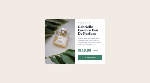
<picture>you’ve more control over the elements and its better than using the product image as<img>orbackground-image. Look that for SEO and search engine reasons it isn't a better practice to import this product image with CSS since this will make it harder to the image. You can manage both images inside the<picture>tag and use the html to code to set when the images should change setting the devicemax-widthdepending of the device (phone / computer) Here’s a guide about how to usepicture:https://www.w3schools.com/tags/tag_picture.aspSee the example below:
<picture>
  <source media="(max-width:650px)" srcset="./images/image-product-mobile.jpg">
  <img src="./images/image-product-desktop.jpg" alt="Gabrielle Parfum" style="width:auto;">
</picture>
✌️ I hope this helps you and happy coding!
Marked as helpful

Join our Discord community
Join thousands of Frontend Mentor community members taking the challenges, sharing resources, helping each other, and chatting about all things front-end!
Join our Discord