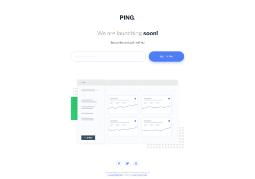
Responsive site using media queries

Solution retrospective
The tricky thing was deciding between spreading the elements equally vertically or letting the body overflow the user's screen. The original design was designed with a 1440x1024 screen in mind. This site had to be responsive, so if I used flexbox and spread the elements equally, The site would've looked weird on smaller screens. I decided to let the body exceed the height of the user's screen should the body overflow the height of the screen.
In the case that the body didn't overflow the body, I set the minimum height to 100vh, That way, at a minimum, the body would at least cover the screen.
In order to show errors in the user's input, I'd use the invalid CSS property of an input element. Using this allowed me to style the input when the value of the input is invalid. Using the same technique as before, I could also let the error message of the input be displayed based on the validity of the user's input.
Please log in to post a comment
Log in with GitHubCommunity feedback
No feedback yet. Be the first to give feedback on ThaBeanBoy's solution.
Join our Discord community
Join thousands of Frontend Mentor community members taking the challenges, sharing resources, helping each other, and chatting about all things front-end!
Join our Discord