Skip to content
  • Unlock Pro
  • Log in with GitHub
Solution
Submitted 7 months ago

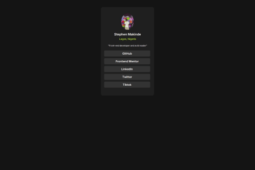
Responsive Social Link Card Using CSS FlexBox

Stephengrammy•60
@Stephengrammy
A solution to the Social links profile challenge
View live sitePreview (opens in new tab)View codeCode (opens in new tab)

Solution retrospective


What are you most proud of, and what would you do differently next time?

using flexbox and article

What challenges did you encounter, and how did you overcome them?

nothing much my babe cheated and broke my heart so i just jumped on the project to clear my head

What specific areas of your project would you like help with?

i just want to see a different css code

Code
Select a file

Please log in to post a comment

Log in with GitHub

Community feedback

  • Alaa Mekibes•2,090
    @alaa-mekibes
    Posted 7 months ago

    You did it good job 🎉 just there are few points to fix :

    • Add favicon between <head> like this :
    <link
          rel="icon"
          type="image/png"
          sizes="32x32"
          href="./images/favicon-32x32.png"
        />
    
    • Use css variables to improved maintainability like this :
    :root {
        --bg-color: hsl(210, 46%, 95%);
        /* Add your other colors here */
    }
    
    body {
        background-color: var(--bg-color);
        /* Other properties */
    }
    
    • Add min-height: 100vh to the body to get full-screen.
    Marked as helpful
  • Aakash Verma•9,500
    @skyv26
    Posted 7 months ago

    Hi @Stephengrammy,

    Great job on the project! Here’s some feedback and suggestions to help you refine your work further:

    1. Avoid Using the <article> Tag Here
      The <article> tag is intended for self-contained content that could stand independently, like a blog post or news article. In this case, a <div> or another more general-purpose container would be more appropriate. 👍

    2. Add Descriptive alt Text for the Image
      Accessibility is key! 🌟 Add meaningful alt text for the image, e.g., alt="Profile picture of Stephen Makinde", to help users relying on screen readers.

    3. Design Consistency
      Try to match your design as closely as possible to the original reference. A pixel-perfect approach can elevate your work. 📏

    4. Avoid Using Fixed Heights
      Instead of hardcoding height: 500px for the .container, let the content determine the height or use padding to maintain spacing. This ensures your layout is more flexible and adapts well to varying content sizes. 📐

    5. Apply DRY Principles to Your CSS
      For example, you can use a shared class for reusable styles (like margins and paddings) to reduce redundancy:

      .nav-link {
          text-decoration: none;
          font-weight: 600;
          color: hsl(0, 0%, 100%);
          background-color: hsl(0, 0%, 20%);
          margin: 10px 5px 0;
          width: 250px;
          border-radius: 5px;
          text-align: center;
          padding: 7px 5px;
      }  
      

      Then remove repetitive margin and padding styles applied separately.

    6. Other Minor Suggestions

      • Ensure your fonts load as expected by double-checking the Google Fonts link.
      • Test hover and focus states thoroughly for a polished interactive experience.

    I hope these pointers help you enhance your project! 🚀

    Happy coding! 💻✨

    Marked as helpful

Join our Discord community

Join thousands of Frontend Mentor community members taking the challenges, sharing resources, helping each other, and chatting about all things front-end!

Join our Discord

Stay up to datewith new challenges, featured solutions, selected articles, and our latest news

Frontend Mentor

  • Unlock Pro
  • Contact us
  • FAQs
  • Become a partner

Explore

  • Learning paths
  • Challenges
  • Solutions
  • Articles

Community

  • Discord
  • Guidelines

For companies

  • Hire developers
  • Train developers
© Frontend Mentor 2019 - 2025
  • Terms
  • Cookie Policy
  • Privacy Policy
  • License

Oops! 😬

You need to be logged in before you can do that.

Log in with GitHub

Oops! 😬

You need to be logged in before you can do that.

Log in with GitHub

How does the accessibility report work?

When a solution is submitted, we use axe-core to run an automated audit of your code.

This picks out common accessibility issues like not using semantic HTML and not having proper heading hierarchies, among others.

This automated audit is fairly surface level, so we encourage to you review the project and code in more detail with accessibility best practices in mind.

How does the CSS report work?

When a solution is submitted, we use stylelint to run an automated check on the CSS code.

We've added some of our own linting rules based on recommended best practices. These rules are prefixed with frontend-mentor/ which you'll see at the top of each issue in the report.

The report will audit all CSS, SCSS and Less files in your repository.

How does the HTML validation report work?

When a solution is submitted, we use html-validate to run an automated check on the HTML code.

The report picks out common HTML issues such as not using headings within section elements and incorrect nesting of elements, among others.

Note that the report can pick up “invalid” attributes, which some frameworks automatically add to the HTML. These attributes are crucial for how the frameworks function, although they’re technically not valid HTML. As such, some projects can show up with many HTML validation errors, which are benign and are a necessary part of the framework.

How does the JavaScript validation report work?

When a solution is submitted, we use eslint to run an automated check on the JavaScript code.

The report picks out common JavaScript issues such as not using semicolons and using var instead of let or const, among others.

The report will audit all JS and JSX files in your repository. We currently do not support Typescript or other frontend frameworks.

Oops! 😬

You need to be logged in before you can do that.

Log in with GitHub

Oops! 😬

You need to be logged in before you can do that.

Log in with GitHub