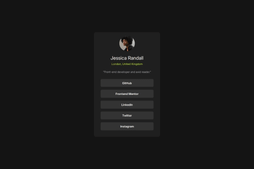
Responsive social-links page

Solution retrospective
Using mobile-first workflow changed the time it took to complete this project
What challenges did you encounter, and how did you overcome them?I want to continue focusing on responsive design and how to correctly apply it into my designs. Also, overall CSS readability is something I want to continue to improve in.
What specific areas of your project would you like help with?-How to simplify my CSS -Need help with media query application
Please log in to post a comment
Log in with GitHubCommunity feedback
- @ricardoychino
Hi,
First of all, visually speaking it is very close to the design provided. Good job on that. But semantically speaking, I recommend you to never shrink the size of the
body. It should always be at least the size of the viewport, because it is the body of the document, the template, the "paper where you'll draw", not a part of it. Wouldn't you find it strange if you receive a test exam or contract on a smaller, borderless piece of paper rather than on A4 paper? That's kind of how it is currently.Semantically, it makes more sense for who is reading you document (search engine bots, other developers) a div with
class="card"with all the content of the...card. What you see must as possible be reflected in the structure (HTML) of the code, and not forcibly adapted. What you could do:<body> <-- The 'paper' <main> <-- You're saying this is the main content on paper <div class="card"> < -- the content -- > </div> </main> </body>It is nice to try to use semantics as possible, but it should make sense. Don't refrain from using classes and divs. If it makes sense, do it!
About CSS
Besides these semantic stuff that I pointed out (
htmlbeing used as the real role ofbody- please avoid stylinghtml; always usebodyor:rootas the "main hub" of your styles), let's focus on how you could simplify your stylesheet.There are bunch of stuff that I'd like to point out, but I think the overuse of
emmetric is the thing you should avoid. As you probably now,emconverts the size topxbased on proportion to the current or parent'sfont-size. There are several 'drilling' on your style that makes it difficult to know what's the actualfont-sizeof the elements at the lowest children level. For example,bodyis 0.8em; thenh4has more .8em (0.8 * 0.8 * 16 (Chrome's default) = 10.24px); and the sameh4hasbottom: 0.95em, what means 0.95 * 0.8 * 0.8 * 16 = 9.728px, which at this point it is pretty much just a random number, not an actual design choice for sizes. Another example is theh2title: the browser's user agent has 1.5em as its defaults, that overridden your 0.8em. What is the actual size in px? You see how the answer takes more time than necessary? That's my point here. Keep it simple and use px if it don't really depends on the parent's font-size. It improves the readability since we don't need to make calculations and it is less abstract for who is reading and analyzing your code. Making it dynamic by changing half a pixel is not worth the complexity.Another related topic that I should point out is, remember what I said about the
bodybeing the "main hub"? That means, declaring all the defaults of your document, such as font, font-size, color of the text, etc., so that every other elements in your HTML inherit these properties. The "supreme" parent in a HTML document is thebodyelement, and in your style it has a.8emfont-size. You should use thebodyto define the default size (inpx) of the document (usually browsers like Chrome has its default as 16px - if you declare, you'll overwrite it... so it is a good practice to declare since each browser could have its defaults).I apologize if it sounded harsh, it was not my intention. My intention here is to be convincing rather than just spout theories. These are mistakes I've made myself in my early days, but I've learned the hard way that it's not a good practice. Anyway, keep it up, you're doing great! I hope my feedback helps you somehow.
- @LarsAdams
Very nice


Join our Discord community
Join thousands of Frontend Mentor community members taking the challenges, sharing resources, helping each other, and chatting about all things front-end!
Join our Discord