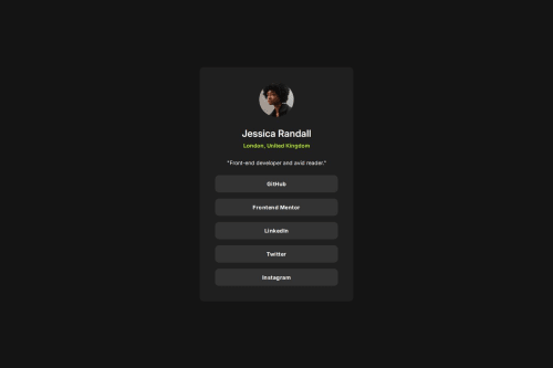
Responsive social links profile using flexbox and clamp()

Solution retrospective
I've noticed that the padding of the card is larger on desktop than on mobile and was wondering how can I achieve responsive padding without using media queries.
Finally I managed this by deciding that the minimum padding value will be 24px based on how the mobile design looked and maximum will be 40px when the card reaches its max width, which I set to 400px looking at the desktop design (I guessed these values by eye because I didn't use the figma file for this project).
I then calculated when does the card reach its maximum width provided I set its width to 87% (based on how wide it looked in the mobile design) and plugged the value (400px/0.87 = ~ 460px) into https://utopia.fyi/clamp/calculator/ as the max viewport width because that's when I want the padding to reach its max value.
For the min viewport width, I set it to 375px which is the size of the mobile design and I want the padding to reach its min value (24px) at that point.
And then of course I set the min and max length unit in the calculator to 24px and 40px. And this is the result I got: clamp(24px, -46.5882px + 18.8235vw, 40px);
I pasted it into my code
.linkcard {
    width: 87%;
    max-width: 400px;
    padding: clamp(24px, -46.5882px + 18.8235vw, 40px);
  ...
}
and it worked exactly like I wanted :)
Please log in to post a comment
Log in with GitHubCommunity feedback
- @anujohnbethel
Nice Job!.
You might consider adding aria-label attributes to your <nav> or anchor tags. This will help screen readers to interpret the navigations for users.
Great work overall - keep it up!
- @glrodriperez98
Alexander3717.....amazing job! Your solution is practically identical to the design. While I'm suppose to offer you feedback I've got to say that you inadvertently answered my feedback question regarding sizing and padding. I will have to take your formula with the site and try it out myself.
My one big piece of feedback would be to try using more semantic HTML. You used a
<main>,headingsand<nav>very well, but maybe try incorporating a<header><section>and<footer>for accessibility purposes.Amazing job!
Kind regards, G


Join our Discord community
Join thousands of Frontend Mentor community members taking the challenges, sharing resources, helping each other, and chatting about all things front-end!
Join our Discord