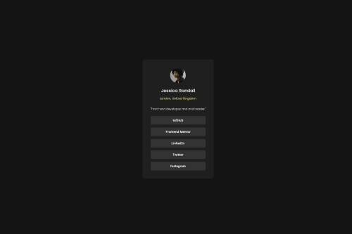
Responsive Social Links Profile Using HTML, CSS

Solution retrospective
I completed the challenge without the help of the Figma design.
What challenges did you encounter, and how did you overcome them?- I did not have access to the Figma design, so it was a little difficult for me to find the size, margin, color of some elements. I solved this using some Chrome extensions such as ColorZilla, Page Ruler,...
- I took more time on how to center elements, how to display buttons as blocks.
Please log in to post a comment
Log in with GitHubCommunity feedback
- P@MikDra1
If you want to make your card responsive with ease you can use this technique:
.card {
width: 90%;
max-width: 37.5rem;
}
On the smaller screens card will be 90% of the parent (here body), but as soon as the card will be 37.5rem (600px) it will lock with this size.
Also to put the card in the center I advise you to use this code snippet:
.container {
display: grid;
place-items: center;
}
Hope you found this comment helpful 💗💗💗
Good job and keep going 😁😊😉
- P@Stroudy
Amazing job with this! You’re making fantastic progress. Here are some small tweaks that might take your solution to the next level…
-
Using a
<main>tag inside the<body>of your HTML is a best practice because it clearly identifies the main content of your page. This helps with accessibility and improves how search engines understand your content. -
Setting
font-size: 62.5%can affect accessibility by reducing the default browser font size, potentially making text harder to read for users with visual impairments. This does make it easier to work out the relative units but at what cost? -
I would put these into a
<ul> <li>, and the text should be wrapped with a<a>so it is accessible with a keyboard using the tab key, Using an<a>tag for navigation is semantically correct, improves accessibility for screen readers, and ensures consistent behavior across browsers, unlike a<button>or a<div>not intended for links.
<div class="content-btns"> <button class="social-btn">GitHub</button> <button class="social-btn">Frontend Mentor</button> <button class="social-btn">LinkedIn</button> <button class="social-btn">Twitter</button> <button class="social-btn">Instagram</button> </div>- Using
max-width: 100%ormin-width: 100%is more responsive than justwidth: 100%because they allow elements to adjust better to different screen sizes. To learn more, check out this article: responsive-meaning. - Developers should avoid using pixels (
px) because they are a fixed size and don't scale well on different devices. Instead, useremorem, which are relative units that adjust based on user settings, making your design more flexible, responsive, and accessible. For more information check out this, Why font-size must NEVER be in pixels or this video by Kevin Powell CSS em and rem explained.- Another great resource for px to rem converter.
You’re doing fantastic! I hope these tips help you as you continue your coding journey. Stay curious and keep experimenting—every challenge is an opportunity to learn. Have fun, and keep coding with confidence! 🌟
-
- @sour413
The page would be good if you put this CSS in your card class example-> .card { border-radius: 5rem;}, rounded card will suit this page and look better.


Join our Discord community
Join thousands of Frontend Mentor community members taking the challenges, sharing resources, helping each other, and chatting about all things front-end!
Join our Discord