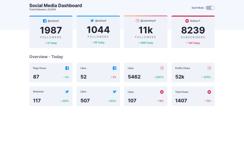
Submitted over 3 years agoA solution to the Social media dashboard with theme switcher challenge
Responsive social media dashboard using React JS and CSS Grids....

@iniyan-web
Solution retrospective
Feedbacks are always appreciated... :)
Code
Please log in to post a comment
Log in with GitHubCommunity feedback
- @mustafaalkhiat
@iniyan-web you made a beautiful and responsive template, and the code clean and readable, May i ask you about media queries since your using them seemlesly. How to use them correctly. is out there any specific sizes for special designs(like libraries,frameworks) or it's totally depends on design itself so i generate a random widths myself. Thanks from now and wish you happy chrismas...

Join our Discord community
Join thousands of Frontend Mentor community members taking the challenges, sharing resources, helping each other, and chatting about all things front-end!
Join our Discord