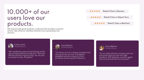
Submitted about 4 years agoA solution to the Social proof section challenge
Responsive Social Proof Landing Page Using HTML, CSS

@AtanasovCode
Solution retrospective
Enjoyed doing this one!
The only thing that I couldn't seem to figure out is how to lower down the review boxes to achieve the effect of one being lower than the other. This is how I did it:
- I used the margin-top to make the review box shorter than the one next to it.
- Than I used the padding-bottom - to give it more padding at the bottom so that it canbe the same size as the othrer box.
I think this worked well with the 3rd box but the second box would gain the same amount of padding no matter the value that I input. Why was that and is there a better way to achieve this?
Code
Loading...
Please log in to post a comment
Log in with GitHubCommunity feedback
No feedback yet. Be the first to give feedback on atanasov36's solution.
Join our Discord community
Join thousands of Frontend Mentor community members taking the challenges, sharing resources, helping each other, and chatting about all things front-end!
Join our Discord