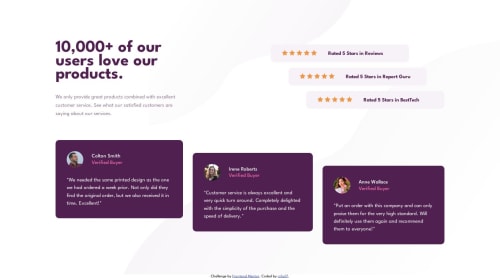
Submitted over 2 years agoA solution to the Social proof section challenge
Responsive Social Proof Section
LVL 2

@rzho17
Solution retrospective
I have issues with setting the max-height of an element, specifically my testimonial containers. I tried to set a max height of 250px but it still continued to grow past it. I assumed it may because I have a flex property on them but I am not sure.
Also I am curious if I am using flexbox too much for each design element. Is this a bad practice? I am just more comfortable using it than grid but will practice other display methods if it is bad practice.
Thanks for any feedback!
Code
Loading...
Please log in to post a comment
Log in with GitHubCommunity feedback
No feedback yet. Be the first to give feedback on rzho17’s solution.
Join our Discord community
Join thousands of Frontend Mentor community members taking the challenges, sharing resources, helping each other, and chatting about all things front-end!
Join our Discord