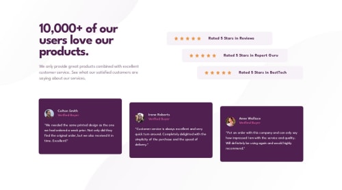
Responsive Social Proof Section

Solution retrospective
I'm most proud of using pseudo-elements (::before and ::after) on the body to position the decorative background images, rather than adding extra <div>s or repurposing existing elements just for styling.
This approach kept the DOM clean, maintained proper separation of concerns, and ensured that the images remained purely visual—hidden from assistive technologies. It felt like a small but meaningful win in writing cleaner, more accessible code.
What challenges did you encounter, and how did you overcome them?One of the main challenges I encountered in this project was implementing the background images at the top and bottom of the application layout.
In a Next.js environment, there are two common ways to handle images: using the built-in <Image> component or applying background-image through CSS.
While the Next.js <Image> component is powerful and optimized, it inserts an actual <img> tag into the DOM. Since these particular images are purely decorative and offer no semantic value, I wanted to avoid adding unnecessary DOM elements—especially ones that screen readers might try to interpret. So that option was a no-go.
Using background-image in CSS was the better fit, but the question became where to apply it. I initially considered adding two <div>s to the page.tsx file and assigning the background images there. However, that again would introduce non-semantic elements purely for styling purposes—not ideal.
Next idea: placing the backgrounds on the first and last components. But that breaks the principle of separation of concerns. Components should own only their own visuals and logic—not global layout decisions like page backgrounds.
Finally, the lightbulb moment: I remembered the ::before and ::after pseudo-elements. These are perfect for purely visual styles. They're invisible to screen readers and don’t clutter the DOM. With some careful styling, I was able to use them on the body tag to position the background images at the top and bottom of the page. They also allowed me to easily swap between mobile and desktop styles via media queries—clean, efficient, and accessible.
Please log in to post a comment
Log in with GitHubCommunity feedback
No feedback yet. Be the first to give feedback on ejparnell's solution.
Join our Discord community
Join thousands of Frontend Mentor community members taking the challenges, sharing resources, helping each other, and chatting about all things front-end!
Join our Discord