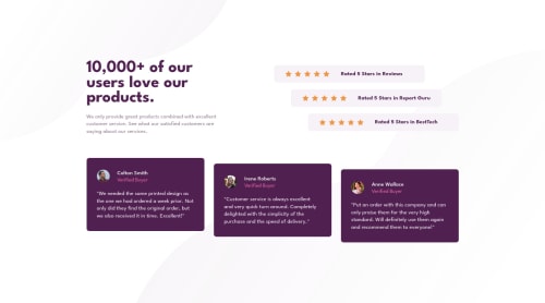
Submitted over 2 years agoA solution to the Social proof section challenge
Responsive Social proof section

@chrisjay358
Solution retrospective
I would like it if my code can be reviewed and feedback is gotten. Lemme know what and how I could have approached a clean code. Thank you
Code
Please log in to post a comment
Log in with GitHubCommunity feedback
- @vanzasetia
Hi, Chris Jay! 👋
Here are some possible improvements.
- Leave the alternative text empty for all the star icons (
alt=""). Those are decorative images. - For your information, decorative images are images that don't add any information and serve only aesthetic purposes.
- Wrap the quote with
<p>element.<blockquote>should have a<p>as a child element. Reference: hail2u/html-best-practices: For writing maintainable and scalable HTML documents #use-appropriate-element-in-blockquote-element - Don't change the
<html>or the:rootfont size. It can cause huge accessibility implications for those users with different font sizes or zoom requirements. - Set a
min-heightinstead of aheighton the<body>element.
For your next project, I recommend writing the CSS using the mobile-first approach (using
min-widthmedia queries). The mobile layout is simple. So, you only need to add more complex styling for larger screen sizes.I hope you find this useful. 🙂
Marked as helpful - Leave the alternative text empty for all the star icons (

Join our Discord community
Join thousands of Frontend Mentor community members taking the challenges, sharing resources, helping each other, and chatting about all things front-end!
Join our Discord