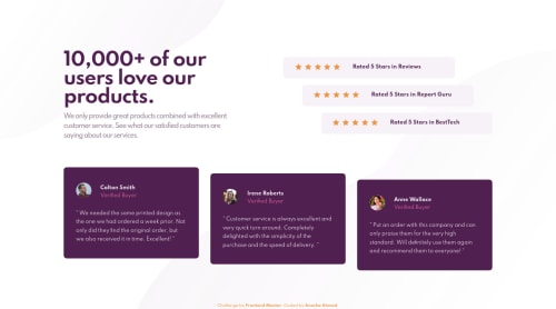
Not Found
Not Found
Not Found
Not Found
Not Found
Not Found
Not Found
Not Found
Not Found
Not Found
Not Found
Not Found
Not Found
Not Found
Not Found
Not Found
Not Found
Not Found
Not Found
Not Found

Submitted

Responsive Social Proof Section using Flexbox

Anosha Ahmed 9,340

@anoshaahmed

Desktop design screenshot for the Social proof section coding challenge

This is a solution for...

  • HTML
  • CSS
1newbie
View challenge

Design comparison


SolutionDesign

Solution retrospective


This was my first time using only rem/em units instead of px. Would appreciate any suggestions to improve.

Community feedback

bunee 2,060

@buneeIsSlo

Posted

Hey! @anoshaahmed, Great job on the challenge. Your solutions is pixel-perfect and responds pretty well. However, I noticed that you used the em unit for setting max-widths on the media queries. This does the job but, is not ideal. The em unit is more suitable for applying padding and margins. This short video should help :)

Marked as helpful

2

Anosha Ahmed 9,340

@anoshaahmed

Posted

@buneeIsSlo Thank you so much I didn't know that.

1

@Kamasah-Dickson

Posted

Grrat job there Anosha....its pixel perfect but I realised the paragraphs in the purple boxes are a bit grey not white....maybe u can make them white later. :)

Marked as helpful

1

Anosha Ahmed 9,340

@anoshaahmed

Posted

@Kamasah-Dickson thanks kamasah!! i'll take a look at it :)

0
PhoenixDev22 16,990

@PhoenixDev22

Posted

Great Work Anosha Ahmed!

Marked as helpful

1

Anosha Ahmed 9,340

@anoshaahmed

Posted

@PhoenixDev22 thank u :)

0

@minahilakhtar

Posted

amazing

Marked as helpful

1

Please log in to post a comment

Log in with GitHub
Discord logo

Join our Discord community

Join thousands of Frontend Mentor community members taking the challenges, sharing resources, helping each other, and chatting about all things front-end!

Join our Discord