Responsive social proof section using Grid, Flex, React, Tailwind

Solution retrospective
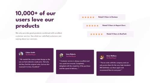
I’m most proud of how the design turned out despite the challenges with aligning elements and fine-tuning background patterns. The use of Tailwind CSS helped with responsiveness and maintaining clean, readable code.
What challenges did you encounter, and how did you overcome them?The main challenge was the tricky positioning of the background patterns and ensuring everything aligned correctly across different screen sizes. Since I didn’t have a Figma file, it was a bit of trial and error to get the sizes and positions right. I solved most of these issues by iterating and adjusting the design step by step.
Another challenge was making sure the rating components aligned consistently. Flexbox and adding flex-shrink-0 to the star icons helped with the alignment issue, and I eventually got everything to sit properly.
What specific areas of your project would you like help with?I would love feedback on the responsiveness of the layout, specifically how the background patterns behave on different screen sizes. Additionally, any advice on optimizing the code or making the structure cleaner would be appreciated.
Please log in to post a comment
Log in with GitHubCommunity feedback
No feedback yet. Be the first to give feedback on Akiz-Ivanov's solution.
Join our Discord community
Join thousands of Frontend Mentor community members taking the challenges, sharing resources, helping each other, and chatting about all things front-end!
Join our Discord