Not Found
Not Found
Not Found
Not Found
Not Found
Not Found
Not Found
Not Found
Not Found
Not Found
Not Found
Not Found
Not Found
Not Found
Not Found
Not Found
Not Found
Not Found
Not Found
Not Found

Submitted

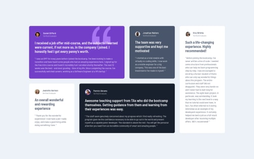
Responsive solution using HTML, SASS, BEM and CSS transitions.

#bem#sass/scss#parcel

@GrzywN

Desktop design screenshot for the Testimonials grid section coding challenge

This is a solution for...

  • HTML
  • CSS
2junior
View challenge

Design comparison


SolutionDesign

Solution retrospective


I had so much fun doing this challenge! I recommend you to do it too! For people not feeling solid in CSS Grid I recommend checking out Grid Garden and than this challenge to get some practice in building grid layouts.

In the solution I used md- prefixes to make my layout suitable for medium sized screens. What do you guys think about this idea? I think it makes things more clearer in the markup and code is easier to understand and maintain. Also, I added some animations when the page loads and when the cursor hovers over sections to make this solution more fancy. I made page responsive even for larger sizes with a new clamp() function in CSS3.

I appreciate any feedback!

Community feedback

Camille 130

@fyrfli

Posted

Oh! I love the transitions!!!! Bravo!

Marked as helpful

1
Aadvik 1,250

@Aadv1k

Posted

Feels like there are soo many ways to approach this problem, from nightmarish "position absolute" to using grid. I Did this challenge using grid-template-areas really enjoyed the simple and intuitive approach to layouts. if you are interested in the code check it out here

Marked as helpful

1

@GrzywN

Posted

@Aadv1k Your solution is great! grid-template-areas are amazing for building layouts like this one. I thought I'll do it with regular grid columns and rows to get some practice in it. I'll definitely use approach grid-template-areas in my future layouts. Have a nice day and happy coding too!

1
Camille 130

@fyrfli

Posted

@Aadv1k Glad I’m not the only one who uses grid-template-areas for this challenge. 😊 I was actually quite proud of that. 🤓

1

@shashreesamuel

Posted

Hey GrzywN good job completing this challenge. Keep up the good work

Your solution looks good however I think that your cards look a little bigger than the actual design. You might want to make them just a little bit smaller if you like

In terms of accessibility your headings can only go up one level which means that if you have an <h1> tag then the next heading tag should be an <h2>.

I hope this helps

Cheers Happy coding 👍

1
Naveen Gumaste 10,480

@NaveenGumaste

Posted

Hello Karol Binkowski ! Congo 👏 on completing this challenge

Let's look at some of your issues, shall we:

  • your code is missing "level-one heading" that means ' use h1 first and then h2, h3 and so on '

happy Coding😀

1

@GrzywN

Posted

When I did this project, I wanted to make it as easy as possible to implement on the website. I made the <h1> tag with the sr-only class to be for screen readers only. Now it's fixed and validator doesn't detect issues anymore.

0

@shashreesamuel

Posted

GrzywN your solution looks good, good job

Cheers Happy coding👍

Marked as helpful

0

@GrzywN

Posted

@TheCoderGuru Thanks, have a nice day 👍!

0

Please log in to post a comment

Log in with GitHub
Discord logo

Join our Discord community

Join thousands of Frontend Mentor community members taking the challenges, sharing resources, helping each other, and chatting about all things front-end!

Join our Discord