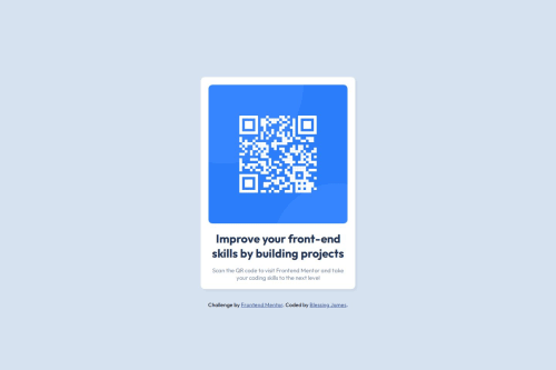
Responsive Solution with HTML & CSS

Please log in to post a comment
Log in with GitHubCommunity feedback
- P@littlesamm96
Readable, well-structured code although I would use more descriptive text for alt attributes of images for screen readers to implement accessibility.
Marked as helpful - @repro123
Nice work. Some corrections.
-
It is a wrong practice to limit the
bodyto a specific height. Usemin-height: 100dvhinstead. On a larger project, that height you used on the body will cause bugs. -
This challenge does not need a media query... However subsequently, if you have to use a media query, they must be in responsive units like rem.
-
Use responsive units for font sizes too. Rem is fine.
/* 1 rem = 16px*/ -
finally, also try and use a Modern CSS Reset at the top of your stylesheets. You can check out Andy Bell's Modern CSS reset or the one by Josh Comeau.
Great job, once more
Marked as helpful -
- @muhammadawaislaal
good its amazing
Join our Discord community
Join thousands of Frontend Mentor community members taking the challenges, sharing resources, helping each other, and chatting about all things front-end!
Join our Discord