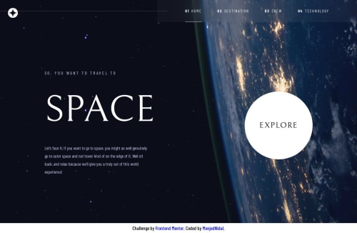
Submitted almost 2 years agoA solution to the Space tourism multi-page website challenge
Responsive Space Tourism App - Reactjs TailwindCSS
react, tailwind-css

@MonjedNidal
Solution retrospective
The most challenging thing in the project was setting it to be responsive in three breakpoints, mobile, tablet, and desktop. So many things change between these breakpoints. This project was made by:
- love ❤️ and many cups of coffee ☕.
- Semantic HTML5 markup
- TailwindCSS - For styles
- CSS custom properties
- Flexbox
- CSS Grid
- Mobile-first workflow
- React - JS library
Code
Please log in to post a comment
Log in with GitHubCommunity feedback
No feedback yet. Be the first to give feedback on Monjed Maswadeh's solution.
Join our Discord community
Join thousands of Frontend Mentor community members taking the challenges, sharing resources, helping each other, and chatting about all things front-end!
Join our Discord