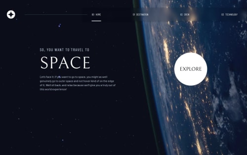
Submitted about 1 year agoA solution to the Space tourism multi-page website challenge
Responsive Space Tourism web page using Tailwind CSS.
tailwind-css

@Adhik-6
Solution retrospective
What are you most proud of, and what would you do differently next time?
- I completed this sooner than I had expected.
- Instead of using multiple HTML pages, I used JavaScript to change the page's contents.
- Learned to use responsive images in Tailwind.
- As I'm getting started with Tailwind CSS, I used a mixture of Traditional CSS along with Tailwind.
- I had difficulty extracting styles from the Figma file because it was my first time using Figma. The sizes given in the Figma file were a little big, so I reduced the size of most of the elements.
- For the hover and active state animation for the nav bar elements I tried using the border property but later I switched to the ::before and ::after pseudo-elements which were easy to use.
- While publishing the live site, I had problems with the assets folder which I initially kept outside of the docs folder. The GitHub couldn't access it. So, I moved the asset folder into the docs folder.
- I used JavaScript to change the contents on all the pages (except the home). While changing I wanted to add a sliding animation to it. I wanted the contents of the page more like to be a carousel.
- In the mobile view I wanted to add a sliding animation/transition to the mobile menu that appears when I click on the hamburger menu.
Code
Loading...
Please log in to post a comment
Log in with GitHubCommunity feedback
No feedback yet. Be the first to give feedback on Adhik's solution.
Join our Discord community
Join thousands of Frontend Mentor community members taking the challenges, sharing resources, helping each other, and chatting about all things front-end!
Join our Discord