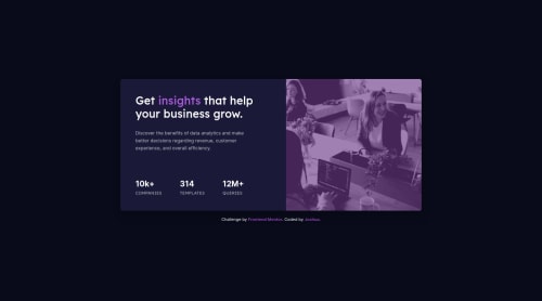
Responsive Stats preview card component

Solution retrospective
Hi everyone, 👋
Happy with how the responsiveness came together in this project. However, I came to wonder what "real world" media queries are targeted in a professional project. 🤔
My current method I'm going by is targeting 1400px and 375px. In between those targets, I've developed a pattern of targeting: 900px, 700px or 800px, based on where it breaks in these challenges.
Is my method normal (fix it as it "breaks")? Should I standardize my approach by targeting specific sizes? For example, common screen sizes mentioned by a blog.
Would really like to hear your thoughts. Thank you for reading, have a great weekend! 🙂
Please log in to post a comment
Log in with GitHubCommunity feedback
- @dtomicic
I would have to agree with the comment above, I always start mobile-first and it's so much easier for me since I end up only using one or two breakpoints (usually just 768px but sometimes also 1440px) if it's not a larger project then more breakpoints are of course useful. But for small project like this I think you could've easily pulled it off going mobile first from 375px and then make the card for that dimension and give it a max-width and then on 768px you just convert it into another style and that's it.
Writing mobile first usually makes your job a lot easier and less frustrating.
Great job, listen to the advices in the comments above and keep on learning 😊
Marked as helpful - @vanzasetia
Hi there! 👋
It's great that you wrap all the page content with the correct landmark elements! Good job! 👍
I notice there's no
metaviewport tag. Every responsive site must have that. Why do you remove that?Regarding media queries breakpoints, I would recommend not setting any specific breakpoints for every project. It's a good practice to only add media queries when the layout is start looks broken. I would recommend making sure that the site still looks on the screen above
1440px. I usually have a.containerthat hasmax-widthto prevent the content from becoming too large.I would recommend writing the styling using the mobile-first approach. It often leads to shorter and better performance code. Also, mobile users won't be required to process all of the desktop styles.
That's it! I hope this information is useful! 😁
Marked as helpful - @melwynt
Hi 👋 I would also think that the "fix it as it breaks" approach is enough.
Otherwise this solution looks quite popular on Stackoverflow:
@media (min-width:320px)  { /* smartphones, iPhone, portrait 480x320 phones */ }
@media (min-width:481px)  { /* portrait e-readers (Nook/Kindle), smaller tablets @ 600 or @ 640 wide. */ }
@media (min-width:641px)  { /* portrait tablets, portrait iPad, landscape e-readers, landscape 800x480 or 854x480 phones */ }
@media (min-width:961px)  { /* tablet, landscape iPad, lo-res laptops ands desktops */ }
@media (min-width:1025px) { /* big landscape tablets, laptops, and desktops */ }
@media (min-width:1281px) { /* hi-res laptops and desktops */ }
Hope this was helpful.
Cheers and have a great weekend too 😀
Marked as helpful


Join our Discord community
Join thousands of Frontend Mentor community members taking the challenges, sharing resources, helping each other, and chatting about all things front-end!
Join our Discord