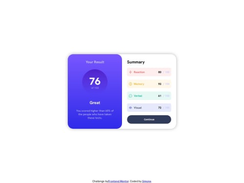
Responsive summary with grid on container and flexbox

Solution retrospective
The styling was pretty hard for me, I'm proud that I managed to find solutions alone and didn't gave up. The next thing i will do different when i have 2 parts on a container is I'm gonna use the grid and grid-template-columns, as it's more simple and effective.
What challenges did you encounter, and how did you overcome them?The styling in general, in both .right and .left containers
What specific areas of your project would you like help with?To make my code more efficient and to cut the code so it's easier to read but with the same results.
Please log in to post a comment
Log in with GitHubCommunity feedback
No feedback yet. Be the first to give feedback on Simone-cpu-debug's solution.
Join our Discord community
Join thousands of Frontend Mentor community members taking the challenges, sharing resources, helping each other, and chatting about all things front-end!
Join our Discord