Responsive Sunnyside Agency Landing Page

Solution retrospective
Hello everyone! I've just finished this challenge but still found some issues with my layout :
-
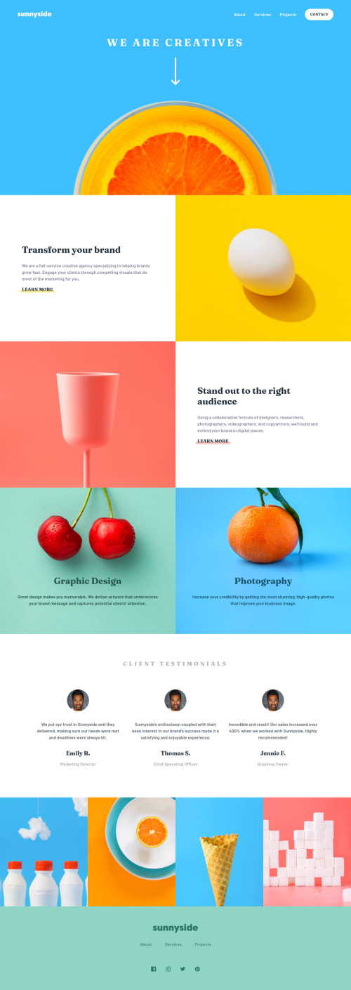
On my nav::before, the triangle shape in my nav on mobile layout. Seems like it's not very neat if you zoom in that thing but when I see that on the desktop layout it's neat
-
When I see my gallery images (the position is above the footer) in my default browser on the mobile which is Mi Browser the images stretch out on their height but when I see that on chrome the images look fine don't stretch out
Could you help me to find the solution? thanks in advance
Please log in to post a comment
Log in with GitHubCommunity feedback
No feedback yet. Be the first to give feedback on Fauzan Reza's solution.
Join our Discord community
Join thousands of Frontend Mentor community members taking the challenges, sharing resources, helping each other, and chatting about all things front-end!
Join our Discord