Not Found
Not Found
Not Found
Not Found
Not Found
Not Found
Not Found
Not Found
Not Found
Not Found
Not Found
Not Found
Not Found
Not Found
Not Found
Not Found
Not Found
Not Found
Not Found
Not Found

Submitted

Responsive Sunnyside Agency landing page using CSS Grid and Flexbox

#sass/scss

@Kamasah-Dickson

Desktop design screenshot for the Sunnyside agency landing page coding challenge

This is a solution for...

  • HTML
  • CSS
  • JS
2junior
View challenge

Design comparison


SolutionDesign

Solution retrospective


Hello Frontendmentors. I underestimated this design, I thought it is so so Trivia but it drained me. It made me learn CSS grid so that I can finish It off quickly. Trying this solution over and over again was so much boring and stressful. besides am able to at least do my best I could. But please do not forget to comment and like I really need your suggestions on this :)

Community feedback

@arkharman12

Posted

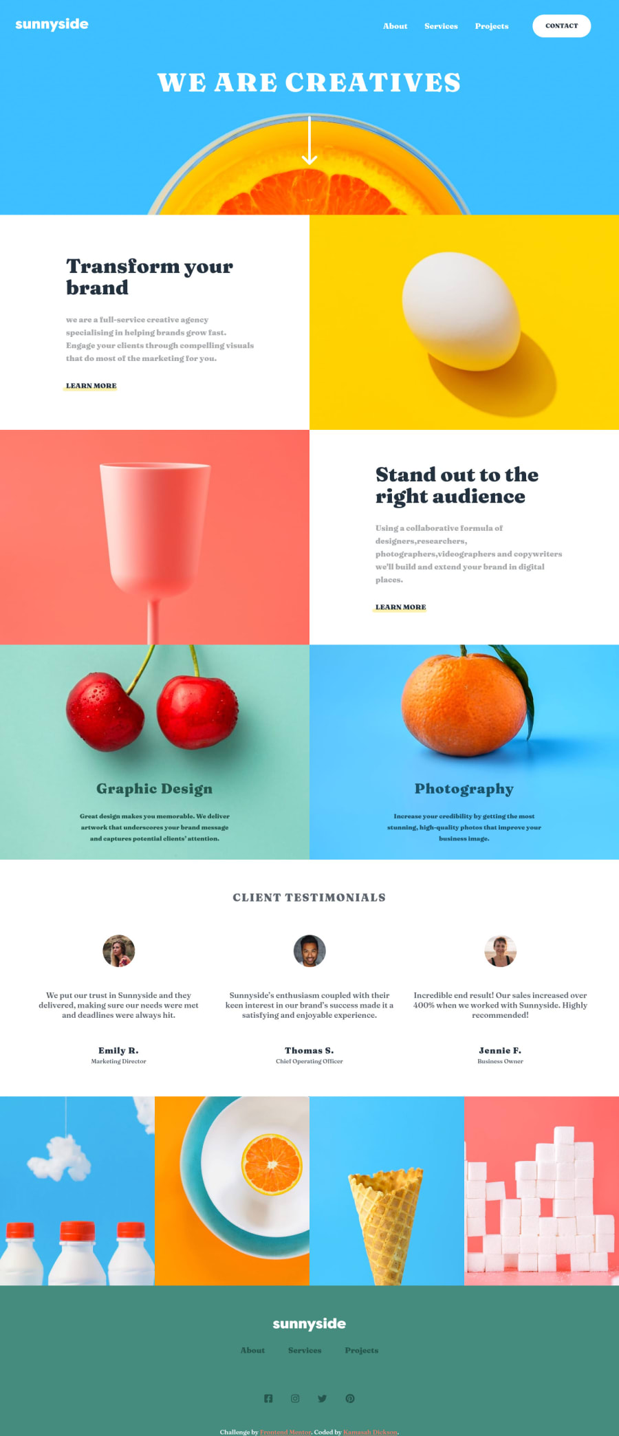
This still quite needs a lot of work in terms of positioning:

  • Fix the spacing for the second section. Buttons are also not as same as the design. The individual boxes create spacing between each other when going responsive. They should all stick together with each other.
  • The content overflows for the cherry and orange section when also going responsive.
  • Client testimonial section is not centered horizontally.
  • If I try to increase the window width while the mobile menu is open. The contact button goes in a weird position.

Good luck!

0

@Kamasah-Dickson

Posted

@arkharman12 Yeah I will update everything as soon as possible I realised I need to learn more about responsive images

e.g how to use the srcset attribute

0

Please log in to post a comment

Log in with GitHub
Discord logo

Join our Discord community

Join thousands of Frontend Mentor community members taking the challenges, sharing resources, helping each other, and chatting about all things front-end!

Join our Discord