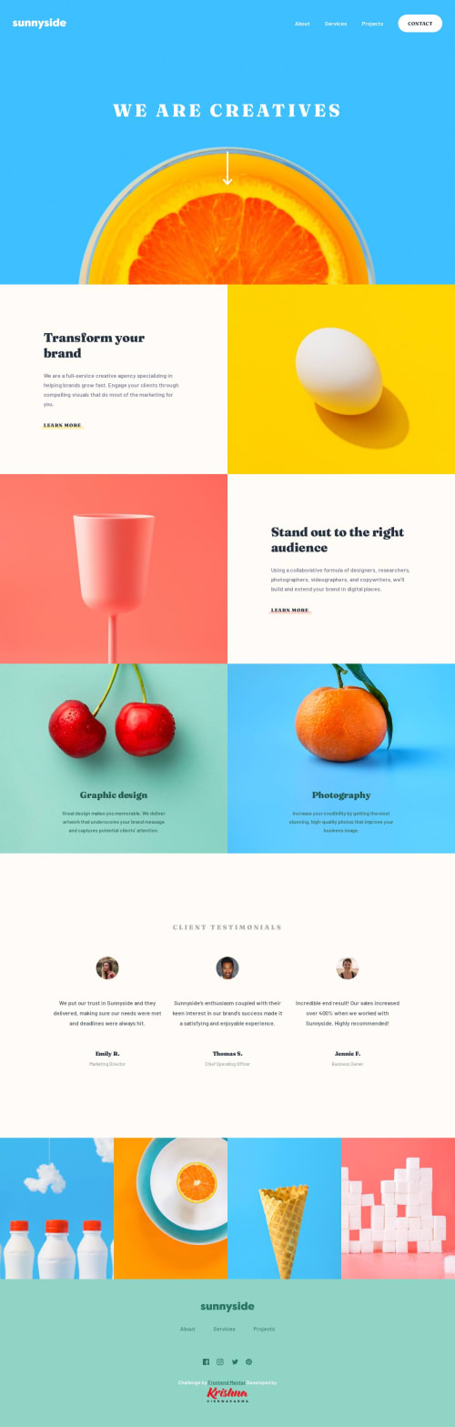
Submitted over 1 year agoA solution to the Agency landing page challenge
Responsive Sunnyside Agency Landing Page using CSS Grids & Flexboxes
accessibility, fresh, progressive-enhancement, semantic-ui, animation

P
@KrishnaVishwakarma1595
Solution retrospective
Hello, Mentors
That's really an amazing challenge for me. Working with CSS grids & Flexboxes and using them to make it responsive. It was fun doing this challenge.
The Challenge
Users should be able to:
- View the optimal layout for the site depending on their device's screen size
- See hover states for all interactive elements on the page
Built with
- Semantic HTML5 markup
- CSS Flexbox
- CSS Grid
- Mobile-first workflow
Let me know your wonderful feedback on this. All comments are welcome!
Happy Mentoring
Code
Please log in to post a comment
Log in with GitHubCommunity feedback
No feedback yet. Be the first to give feedback on Krishna Vishwakarma's solution.
Join our Discord community
Join thousands of Frontend Mentor community members taking the challenges, sharing resources, helping each other, and chatting about all things front-end!
Join our Discord