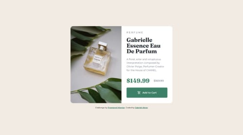
Responsive Product Card with HTML, CSS, Flexbox and Media Query

Solution retrospective
I'm happy to have done this exercise quickly and it looks very similar to the original, even without having the figma measurements. I was also proud of not having to review any content to do it and simply did it from my head, I added some animations when changing breakpoints that enriched the site!
Next time, I would perhaps work better on responsiveness with concepts that I haven't learned yet, such as clamp, calc, rem, etc. And I would work better on the use of flexbox.
What challenges did you encounter, and how did you overcome them?This challenge was very easy and went quickly, a sign that we are learning more and more.
What specific areas of your project would you like help with?Responsiveness!
Please log in to post a comment
Log in with GitHubCommunity feedback
- @Bensolve
Hey! 👋 I really enjoyed checking out your solution.
✅ What I liked:
You nailed it — completing it from memory and still getting that close to the original is impressive. The breakpoint animations were a nice touch that made the experience feel more dynamic.
🚀 Keep going!
It’s great that the challenge felt easy — that’s a strong sign of growth. You’re clearly making solid progress!
Marked as helpful

Join our Discord community
Join thousands of Frontend Mentor community members taking the challenges, sharing resources, helping each other, and chatting about all things front-end!
Join our Discord