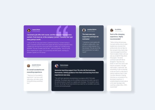
Responsive Testimonial Card Using CSS Grid

Solution retrospective
I am proud that I even completed this I had to fight with this grid layout. Had centering issues. Next time I will pay keen attention to how I set up my grid rows and columns in relation to the container size.
What challenges did you encounter, and how did you overcome them?The challenge was the grid rows and column sizes and having everything centered. I am not to sure if I overcame anything as the final output might not match the solution. I will definitely work on CSS grid for sure its completed. I wanted to challenge myself that's why I followed the requirement and used grid layout instead of flexbox.
What specific areas of your project would you like help with?Tips on CSS Grid Layout would be great. Thanks!
Please log in to post a comment
Log in with GitHubCommunity feedback
- @micheldrv
Your solution looks good, if only that the cards are not centered on the screen in the desktop layout.
Looking at your code, I think your code style could be improved. Try reducing the amount of consecutive empty lines, for example, and make sure that indentation is consistent.
My suggestion is to use the Prettier extension, if you're using VSCode, and setting it up to format the document on save. It's a great way to improve code style without much effort.
Marked as helpful

Join our Discord community
Join thousands of Frontend Mentor community members taking the challenges, sharing resources, helping each other, and chatting about all things front-end!
Join our Discord