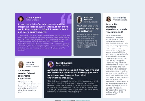
Responsive Testimonial Grid Section using HTML amd CSS Grid

Solution retrospective
What I find difficult while building the project:
The responsiveness. I tried my best not to make my cards look too big bespecially on desktop but I don't know how to go about it.
Which areas of my code am I unsure of:
That will be the responsiveness.
I need documentations on grid. This should go a long way to boost my learning. This is like the first grid project I will do.
I await you helpful feedback please.
Please log in to post a comment
Log in with GitHubCommunity feedback
- @laceeder
https://css-tricks.com/snippets/css/complete-guide-grid/
this helped me understand Grid when I worked on a project in the course I'm taking! It's very thorough and breaks it all down. There's also a lot of great youtube videos too.
Some tips: When you're writing your html, make sure to remember to write in a way that'll make sense to someone else looking at it. For instance, why use the graduates' last names? What does "bold-para" mean? And remember, it's best practice to use "-" and no spaces in your div classes and ids. Keep your names short, sweet, and to the point :)
You also must follow the style guide. This is why your desktop view looks big. The h1, h2, h3, h4 are all using default font sizes instead of setting your default font size to 13px like in the style guide. You also didn't call your font correctly when doing "font-family", so this also will affect the size and general appearance of your work because it's not inputting the font because it doesn't just know "Barlow", you have to say "Barlow Semi Condensed, sans serif" for it to work properly.
Also make sure to leave the <html lang="en"> at the top of your html document in that file, it gives an error for accessibility issues.
Other than that, everything else looks really great! You've done a great job! Keep learning and good luck! :) I was actually looking at your code for guidance on my own version of this challenge!
Marked as helpful - @didyouseekyng
Halo!! I'm back again..I see @laceeder has given some helpful feedback already so i'll chip in one or two:
-
Considering how you name your classes, I believe you can improve that aspect by learning a naming convention. Currently I use the BEM Naming Covention which helps me name classes easily. Surf YouTube for more content. It's worth the time.
-
I noticed your code was covered with a whole lotta
div
tags, which doesn't help semantically. That's probably why you have more accessibility issues here compared to the Four-card Feature challenge where you used semantic HTML tags like yourmain
,header
andfooter
. I think this just needs a more conscious effort when writing code for your next challenge.
- Anyway, you've done well completing this challenge, but the aim is to make the next code better! Kudos 🙌
Marked as helpful -
Join our Discord community
Join thousands of Frontend Mentor community members taking the challenges, sharing resources, helping each other, and chatting about all things front-end!
Join our Discord