Not Found
Not Found
Not Found
Not Found
Not Found
Not Found
Not Found
Not Found
Not Found
Not Found
Not Found
Not Found
Not Found
Not Found
Not Found
Not Found
Not Found
Not Found
Not Found
Not Found

Submitted

Responsive Testimonial Grid Section with HTML & CSS

#accessibility
kounikβ€’ 300

@Valhalla-2

Desktop design screenshot for the Testimonials grid section coding challenge

This is a solution for...

  • HTML
  • CSS
2junior
View challenge

Design comparison


SolutionDesign

Solution retrospective


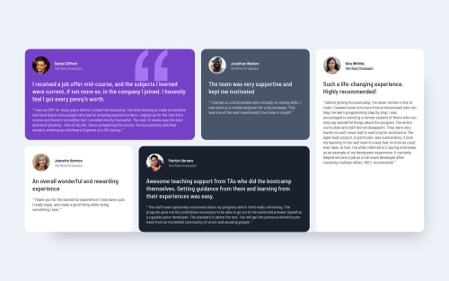
wasn't able to make the box-shadow to look exactly like the desktop-design , How can i make it look like this ?

Community feedback

AntoineCβ€’ 1,180

@AntoineC-dev

Posted

Hello Kounik. Congratulations on completing this challenge. It is well done.

However i have some suggestions for you:

  • Regarding your question I think the problem is that on the design each card has it's own shadow rather than the all section of card. You might wanna try this and see if it matches with the design files. It will also remove the "hovering effect" & sharp edges it gives to you card section in the current solution.

  • I would also add a bit more spacing between each card title and the review text below.

  • If you open your browser developer tools (with F12 for chrome and firefox) and look at the mobile version of your site you will see that you can't scroll through the page. This is because you set a height: 100% on your body. To fix this you should use the min-height property instead. I would also add some vertical padding so the first and the last card don't stick to the window borders.

body {
  height: 100vh; -- Remove this

  min-height: 100vh   -- Add this instead
  padding-block: 1rem

  width: 100%;
  background-color: var(--lgrayish-blue);
  font-family: var(--barlow);
  font-size: var(--fond-md);
  display: flex;
  justify-content: center;
  align-items: center;
}

Again good job and happy coding. Peace πŸ˜€

Marked as helpful

0

kounikβ€’ 300

@Valhalla-2

Posted

@AntoineC-dev thank you very much ,,, it is very helpful ,,, thanks for your feedback

1
Lucas πŸ‘Ύβ€’ 104,580

@correlucas

Posted

πŸ‘ΎHello Kounik, congratulations for your new solution!

❓ Answering your question:

The box-shadow is a bit too evident, this is due the opacity and blur. The secret to create a perfect and smooth shadow is to have low values for opacity and increase blur try this value instead: box-shadow: 6px 2px 17px 4px rgb(72 85 106 / 23%);

If you’re not familiar to box-shadow you can use this site to create the shadow design and then just drop the code into the CSS: https://html-css-js.com/css/generator/box-shadow/

✌️ I hope this helps you and happy coding!

0

Please log in to post a comment

Log in with GitHub
Discord logo

Join our Discord community

Join thousands of Frontend Mentor community members taking the challenges, sharing resources, helping each other, and chatting about all things front-end!

Join our Discord