Submitted over 1 year agoA solution to the Testimonials grid section challenge
responsive-testimonial-grid

@prem-kumart
Solution retrospective
What are you most proud of, and what would you do differently next time?
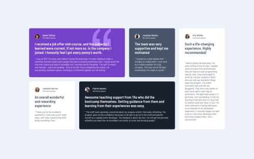
- Work-flow improved greatly when using grid and flex box.
- alining the photo and name ; but flex box did the trick.
- how can I improve organization of code and increased minimalism.
Code
Loading...
Please log in to post a comment
Log in with GitHubCommunity feedback
No feedback yet. Be the first to give feedback on Prem Kumar's solution.
Join our Discord community
Join thousands of Frontend Mentor community members taking the challenges, sharing resources, helping each other, and chatting about all things front-end!
Join our Discord