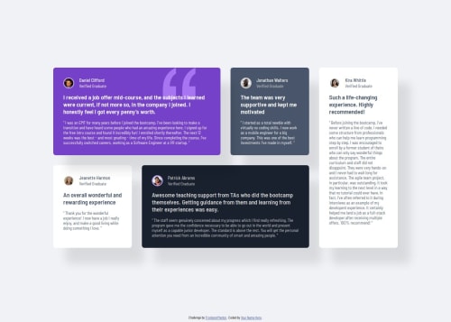
Responsive testimonial page using CSS Grid

Solution retrospective
I'm very happy with how the page layout transitions. I think it looks fairly smooth and the page looks good on all different screen sizes. I can't think of anything I would do differently.
What challenges did you encounter, and how did you overcome them?This was my first project using grid that wasn't a follow-along tutorial type thing. It threw me for a loop when I defined grid-areas on my media query and when I went back to the mobile view they had all stacked on top of each other. Kinda panicked because I didn't know where all my cards had gone. Eventually figured out that defining grid areas before mapping their positions caused them to stack in the z axis. Other than that hiccup everything felt good.
What specific areas of your project would you like help with?I think I did pretty well, but would always welcome constructive criticism. I feel like I could always be more efficient with my code.
Please log in to post a comment
Log in with GitHubCommunity feedback
- P@klhaug
Looks really good!
Maybe use something different than <span> for the names? I dunno, maybe someone else can comment on that. I used heading-tags for the name... But I don't know either if that's the most semantic way.
Your code looks good and organized. Keep up the good work!
Marked as helpful

Join our Discord community
Join thousands of Frontend Mentor community members taking the challenges, sharing resources, helping each other, and chatting about all things front-end!
Join our Discord