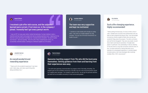
Responsive testimonials grid layout using Grid and Flexbox

Please log in to post a comment
Log in with GitHubCommunity feedback
- @njmoon21
Great job on the grid layout. The testimonies that are taller/wider relative to the other testimonies are in their correct positions. Furthermore, you were successful in making Kira's testimony the last one in mobile view when she visually appears to be the third one on desktop view.
One slightly significant thing I would change about the grid layout is how it behaves when you stretch out your window. I noticed that when I viewed it full-screen, the testimonies were fairly stretched out. I believe(?) you can fix this small issue by using "margin-inline: auto;" on the class that represents your grid-layout.

Join our Discord community
Join thousands of Frontend Mentor community members taking the challenges, sharing resources, helping each other, and chatting about all things front-end!
Join our Discord