


@SzymonRojek
Posted
Hi Bruno,
Well done! :D
I have checked your HTML and have a few tips for you:
- you have used so many divs but we have also semantic tags. What do you think about the main, section, article, header, blockquote - just read about them and few of them add to your project. I can recommend the MDN documentation;
- don't need to use words like picture or image, photo, icons in the alt text as it's already announced as being an image => we can easily type the name like alt="Jonathan" etc; Also, it is good to ask what kind of role img does have, for example: if we have decorative img - in these cases, a null (empty) alt text should be provided (alt="") so that they can be ignored by assistive technologies, such as screen readers;
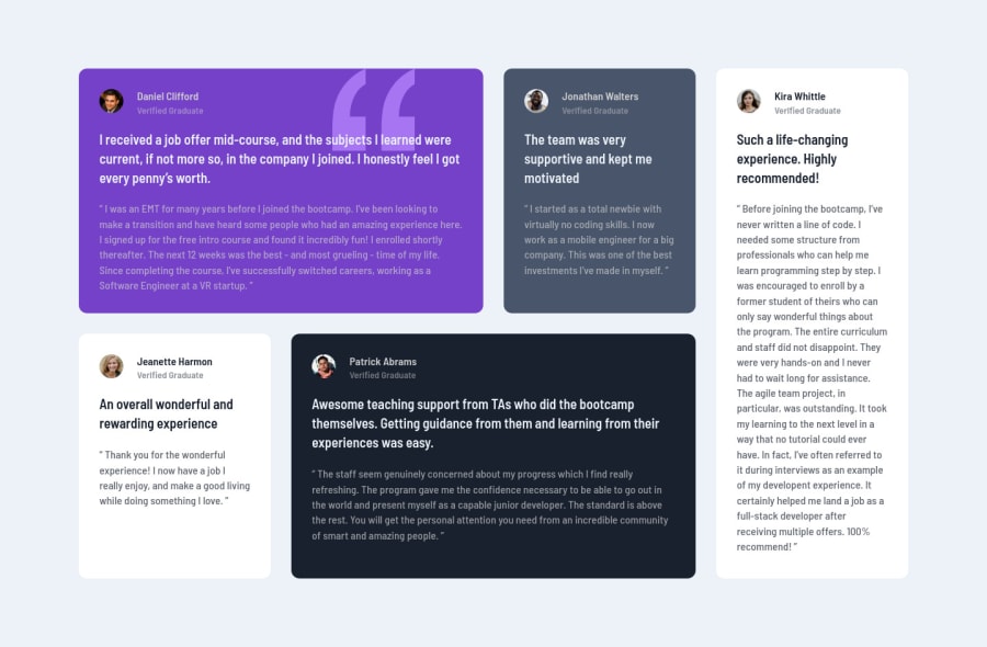
- you didn't use the main h1: just to let you know, you should only use one h1 per page. Using more than one will not result in an error, but using only one is seen as a best practice. It makes logical sense => h1 is the most important heading, and tells you what the purpose of the overall page is. In my opinion, you can use h2 for the name "Daniel Clifford", p tag for rest of them. In this example h1 can be treated as a hidden content with the class= "sr-only" at the beginning of the project:
Finally, congrats! ** Please, don't forget to upvote any comments on here that you find helpful. That's it from me. Hopefully, it will help you.
Greetings :D
@DownTheMatrix
Posted
@SzymonRojek Hi, thanks for the thorough feedback, I appreciate it. A few things though that I couldn't verify:
-
"you didn't use the main h1[...]". Yes, I didn't, and I wouldn't use a h1 when it comes to a component like this one, as it's almost impossible to determine which heading should be more prominent. In a standard landing page, though, I would definitely use it.
-
"the footer hasn't been added". Correct, I didn't implement a footer since the design didn't include one.
-
"the quotation mark should be under the text[...]". Yes, it is indeed below the text (it has a lower position in the z-index stacking), at least, it displays as such on my end on both Chrome and Firefox and for every breakpoint.
-
"your solution includes only mobile devices[...]". I can't verify this on my end. The component is fully responsive on Chrome and Firefox, and the cards arrange themselves (I used CSS Grid) into 4 columns as soon as you hit a desktop viewport size (1440px).
That being clarified, thanks again for the detailed comment :)
@SzymonRojek
Posted
@DownTheMatrix
Hi again :D
(I am using the chrome browser).
That's true with the heading. This is a testimonial so IMO the testimonial is the most important here.
I see, what do you think about ipads and tablets devices - let me explain: firstly, you can go from one column ( mobiles, like you did), then create two pairs with two boxes (2x2) and below will be the 5th box at the bottom along the entire length of the container. Finally, will be the desktop version => otherwise all content will be too wide on these devices between mobile and desktop.
@DownTheMatrix
Posted
@SzymonRojek Hello again, and thanks for the feedback.
About the h1, as you suggested earlier, it shouldn't be repeated, so making the testimonial name as such, it would defy that principle, as we have several cards with several similar elements. Therefore, in this particular case, I wouldn't use it at all (personal preference).
For the breakpoints, I would normally agree with you, and in fact I usually tend to take into account every possible breakpoint, including the landscape mode, for all of my projects. For this particular challenge, though, I saw that only two breakpoints were provided: mobile and desktop, and that's why I only implemented them. But yeah, it would be an extra bonus and a good practicing opportunity.
Have a nice day :)
@SzymonRojek
Posted
@DownTheMatrix
In this particular case, you can use h1 with the class hidden "sr-only" for the Screen Readers and name it. It is a small detail, just to show more possibilities.
Ps. I did point about the quotation mark => it is about ** the mobile design**.
Have a nice day too :D
