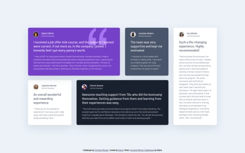
Responsive testimonials grid section using grid and CUBE CSS

Solution retrospective
Just a quick project to practice grid and CUBE CSS!
Please log in to post a comment
Log in with GitHubCommunity feedback
- @correlucas
👾Hello Elaine, congratulations for this pixel perfect solution!
🕵️Is hard to point something in your solutions because they're ever clean and consistent. But in this case there's only a detail that you probably did on purpose, that are the borders around the profile photo, the only photos that have it are the purple and black one, but I'm sure you add to the others because look better like this, so my bad! 😅
🧓 For the card semantics I guess you probably know it too, but you can replace the card divs with
articleand the paragraph withblockquote(this is amazing, someone told me that last week and I didn't knew exists a specific tag for quotes).🤯 I usually propose people to do a media query for tablets, but you went far and did two aditional layouts for the grid. Really impressive.
I come to try to leave you a feedback but ended that I learned a lots.
Congrats and happy coding!
Marked as helpful

Join our Discord community
Join thousands of Frontend Mentor community members taking the challenges, sharing resources, helping each other, and chatting about all things front-end!
Join our Discord