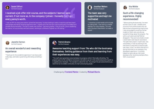
Responsive testimonials grid using CSS Grid & Flexbox

Solution retrospective
I'm most proud of building a complex responsive grid layout that looks clean and functional across all screen sizes. The use of CSS Grid and Flexbox together gave me full control of the layout. Next time, I’d plan my structure with SCSS to make things even more maintainable.
What challenges did you encounter, and how did you overcome them?My biggest challenge was getting the layout to work across devices. Switching from a fixed layout to a mobile-first CSS Grid approach solved this. I also struggled with positioning the quote SVG in the background, but using z-index and "position: absolute" helped me get it right.
What specific areas of your project would you like help with?I’d appreciate feedback on my use of CSS Grid and overall layout efficiency. I'm also curious if there are better approaches for managing spacing and stacking behavior in a responsive grid context.
Please log in to post a comment
Log in with GitHubCommunity feedback
- @Ahmad-Wafa
Great Job bro ! There are something , you must make the task in the middle of the page ,Also you should make light shade to all the boxes

Join our Discord community
Join thousands of Frontend Mentor community members taking the challenges, sharing resources, helping each other, and chatting about all things front-end!
Join our Discord