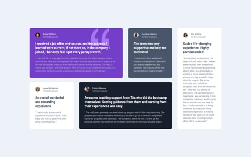
Responsive Testimonials page with Grid Layout

Solution retrospective
I am happy that I got the layout to match, I haven't used grid layouts very much but I feel confident with them after creating this design. I was able to create two different grid layouts for different viewport sizes, along with using flexbox for mobile.
What challenges did you encounter, and how did you overcome them?I had some trouble getting the main section to center in the viewport. I ended up finding some unneeded code that was limiting the height of the body and causing the card container to overflow, so the margin wasn't showing.
What specific areas of your project would you like help with?Any general feedback or tips on how to improve. I'm not confident I have the fonts 100% correct, but I did follow the figma design. It could just be the way that my browser displayed it vs. the design file.
Please log in to post a comment
Log in with GitHubCommunity feedback
No feedback yet. Be the first to give feedback on rmmcfarlin's solution.
Join our Discord community
Join thousands of Frontend Mentor community members taking the challenges, sharing resources, helping each other, and chatting about all things front-end!
Join our Discord