Responsive theme switcher using SCSS (Responds to user theme pref)

Solution retrospective
I don't think it was in the requirements to make it respond to your windows\phone theme but it was a thing that I wanted to try out so I did
Also tested out making a button specifically for accessibility reasons (don't know how useful it might be for a non-sight user to have a dedicated theme switcher, but accessibility was one of the things that I wanted to learn aswell)
If there is any issues about wrapping <section> in the <a> element, I did that as a quick fix and didn't really think too much about it
I had some difficulties with the toggle button because this was my first time making one of them, was really satisfied with the final result
Please log in to post a comment
Log in with GitHubCommunity feedback
- @AlexKMarshall
Hey there, this is looking very good, it's nice and responsive at most screen sizes. It overflows a bit on very small widths, which could be fixed, but that's a very minor point.
Well done for thinking of the accessibility of the theme toggle. People using screen readers are not always blind or visually impaired, so it is still useful for this theme toggle. Because you've made it using an
<input>field it already has the html in place to be accessible, you don't actually need a separate button. What you do need though is a focus style on the switch so that you can see when you are interacting with it with a keyboard.For the rest of the HTML there are a couple of issues. Mainly around the use of headings. Having an
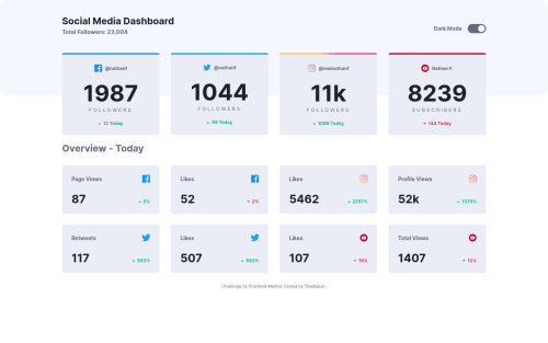
<h2>with a value of 1987 wouldn't make sense for someone navigating by heading. We need something more appropriate. In this case maybe you could have a hidden heading of Facebook, Twitter etc for each of the cards. It is a tricky one though. These kind of data-heavy apps can be difficult to decide on good semantics for.Your question about wrapping the things with an
<a>tag is a good one. It's technically valid, but won't be read very well with a screen-reader. There's an excellent article by Heydon Pickering that goes into great detail about creating an accessible card, including how to make it a clickable link. Well worth reading https://inclusive-components.design/cards/Marked as helpful - @Draghonite
Hi TiredQuan. Great work on your implementation. Having just completed my version, I'm glad I didn't peek at yours first. I second Alex's feedback and would also add that the organization of the SCSS is pretty solid.
For better maintainability and reuse of styles, I do prefer a hierarchical structure that Saas provides over using long class names, but this depends highly on your and your team's standards. As for accessibility, I'd point you to the Accessibility Issues on your submission -- only 2 at the time of this writing, which isn't bad.
Again, nice work. As soon as the design loaded on the page with the sleek CSS animations, I knew it was going to be a good one!
Marked as helpful


Join our Discord community
Join thousands of Frontend Mentor community members taking the challenges, sharing resources, helping each other, and chatting about all things front-end!
Join our Discord