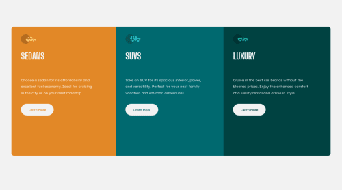
Submitted over 3 years agoA solution to the 3-column preview card component challenge
Responsive Three Column Layout using HTML and CSS Flexbox

@astijusk101
Solution retrospective
Everything was easy to implement, apart from one thing. When shrinking the window size, the buttons do not line up vertically, as the length of the paragraphs above each button is not equal. So when there is a line break in one of the paragraphs, the button in that section shifts downwards. Does anyone know how to solve this?
Code
Loading...
Please log in to post a comment
Log in with GitHubCommunity feedback
No feedback yet. Be the first to give feedback on Astijus Karvauskas's solution.
Join our Discord community
Join thousands of Frontend Mentor community members taking the challenges, sharing resources, helping each other, and chatting about all things front-end!
Join our Discord