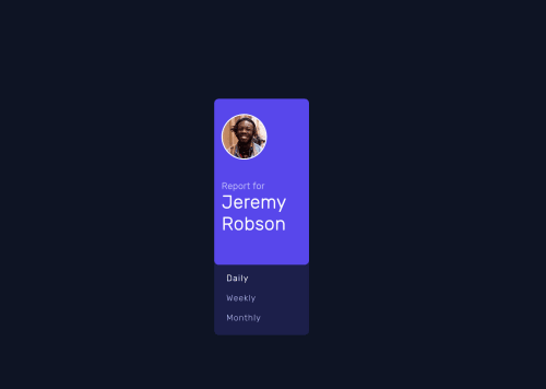
Submitted almost 3 years agoA solution to the Time tracking dashboard challenge
Responsive Time Tracker Page

@Mathitarazonad
Solution retrospective
If you have a suggestion, please let me know!
Code
Please log in to post a comment
Log in with GitHubCommunity feedback
- @cr1deg0
Hi Mathias
Your solution looks good, I specially like that you've introduced a media query for medium screen sizes. However the design comparison screenshot above looks odd. Perhaps because of the way you've centered the content on the screen, instead of using "padding" in your ".main-container" you could try: body { display: flex; justify-content: center; align-items: center; height: 100vh; } Hope it helps! Cristina
Marked as helpful

Join our Discord community
Join thousands of Frontend Mentor community members taking the challenges, sharing resources, helping each other, and chatting about all things front-end!
Join our Discord