Submitted about 1 month agoA solution to the Time tracking dashboard challenge
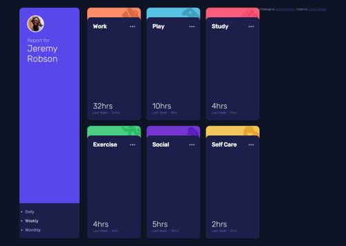
Responsive Time Tracking Dashboard

@kadhirshankar
Solution retrospective
What are you most proud of, and what would you do differently next time?
Matching the design as closely as possible. Next time, I would plan my CSS variables better.
What challenges did you encounter, and how did you overcome them?Tweaking spacing, font sizes, and layout
What specific areas of your project would you like help with?Making the JavaScript cleaner and ensuring I used the most semantic HTML tags.
Code
Please log in to post a comment
Log in with GitHubCommunity feedback
- @rtoddm
Your solution looks good overall. The only discrepancy is the height of your cards. I would check your height and media queries just to make sure your layout is breaking on the larger screen. Also your nav options are still displaying bullet points. Try "list-style-type: none" on your .timeframe-selector class in CSS and that should fix it for you.

Join our Discord community
Join thousands of Frontend Mentor community members taking the challenges, sharing resources, helping each other, and chatting about all things front-end!
Join our Discord