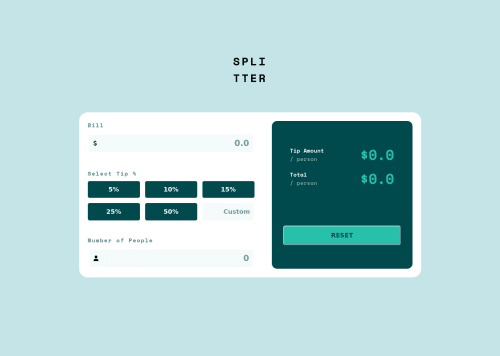
Responsive Tip Calculator App

Solution retrospective
It is hard for me to make it responsive. I feel I made it too customized to desktop devices. I would like to know the best practices for resposiveness in this project
Please log in to post a comment
Log in with GitHubCommunity feedback
- @Jolijn0101
Hi Yagyesh Bobde, congratulations with finishing this project🎉
I saw in your code you already use media queries in your css and the card wil transform in to one column for mobile devices. That’s already a good start.
Do you know that google dev tools has options to view your website on multiple devices? That could make te task of making it responsive a little bit easier. Then you could see when your layout breaks and needs to be adjusted in your code. This is a link to an article about it: https://developer.chrome.com/docs/devtools/device-mode/
Kevin Powell has a great video about making layouts responsive. This is de link to his video: https://www.youtube.com/watch?v=VQraviuwbzU
Hopefully this feedback was helpful and great job making this card looking so great!
Marked as helpful

Join our Discord community
Join thousands of Frontend Mentor community members taking the challenges, sharing resources, helping each other, and chatting about all things front-end!
Join our Discord