Not Found
Not Found
Not Found
Not Found
Not Found
Not Found
Not Found
Not Found
Not Found
Not Found
Not Found
Not Found
Not Found
Not Found
Not Found
Not Found
Not Found
Not Found
Not Found
Not Found

Submitted

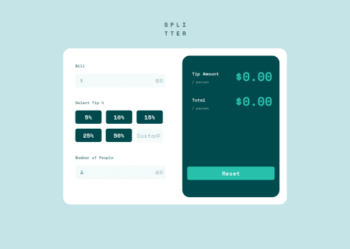
Responsive Tip Calculator App

Gabriela 100

@ga-bri-ela

Desktop design screenshot for the Tip calculator app coding challenge

This is a solution for...

  • HTML
  • CSS
  • JS
2junior
View challenge

Design comparison


SolutionDesign

Solution retrospective


Hi everyone!

It took me quite some time to figure out this challenge. I thought it was going to be easier to break it down, but I soon learned that I was mistaken.

The big game changer for me was understanding how to better uses classes with JavaScript. This has opened so many possibilities for problem solving and that was very exciting.

I do have a question for the community: I have chosen to disable the buttons that allow the user to select a percentage, after the first selection is done. But I find that it is quite bad UI that when the user hovers on top of the disabled buttons they would see the changes in the hovering state. I have tried to find a solution to disable the hovering style once the buttons were disabled, but I was not successful. Does anyone have any idea how I could tackle that?

Thank you in advance for your help, comments or feedback!

Community feedback

Adriano 33,990

@AdrianoEscarabote

Posted

Hi Gabriela, how are you?

I really liked the result of your project, but I have some tips that I think you will like:

1- Every page should have one main landmark <main>. So replace the div that wraps the whole content with <main> to improve the accessibility. click here

2- All page content should be contained by landmarks, you can understand better by clicking here: click here

We have to make sure that all content is contained in a reference region, designated with HTML5 reference elements or ARIA reference regions.

Example:

native HTML5 reference elements:

<body>
    <header>This is the header</header>
    <nav>This is the nav</nav>
    <main>This is the main</main>
    <footer>This is the footer</footer>
</body>

ARIA best practices call for using native HTML5 reference elements instead of ARIA functions whenever possible, but the markup in the following example works:

<body>
     <div role="banner">This is the header</div>
     <div role="navigation">This is the nav</div>
     <div role="main">This is the main</div>
     <div role="contentinfo">This is the footer</div>
</body>

It is a best practice to contain all content, except skip links, in distinct regions such as header, navigation, main, and footer.

Link to read more about: click here

2- Why it Matters

Navigating the web page is far simpler for screen reader users if all of the content splits between one or more high-level sections. Content outside of these sections is difficult to find, and its purpose may be unclear.

HTML has historically lacked some key semantic markers, such as the ability to designate sections of the page as the header, navigation, main content, and footer. Using both HTML5 elements and ARIA landmarks in the same element is considered a best practice, but the future will favor HTML regions as browser support increases.

Rule Description

It is a best practice to ensure that there is only one main landmark to navigate to the primary content of the page and that if the page contains iframe elements, each should either contain no landmarks, or just a single landmark.

Link to read more about: click here

Prefer to use rem over px to have your page working better across browsers and resizing the elements properly

The rest is great!!

Hope it helps...👍

Marked as helpful

1

@miranlegin

Posted

Hi Gabriela,

you can use :not pseudo class with conjunction with attribute selector [disabled] which you added to the buttons to form something like this for example: button:not([disabled]):hover and place the rest of the rules inside this selector like this:

button:not([disabled]):hover {
    background-color: hsl(172, 57%, 75%);
    color: hsl(183, 100%, 15%);
}

I would also add cursor: pointer on hover on buttons just to get more logic in appearance.

One more thing i noticed now is that if user enters some values in the calculator and selects "wrong" tip value and wants to change it, the only way to change a tip percentage selection is to reset everything and starts from scratch. Better way in my opinion would be to not disable buttons after initial chosen option. The path of least resistance is the answer ;)

Keep coding!

Cheers, Miran

Marked as helpful

1
Aatypic 490

@Aatypic

Posted

Hello and congratulations on your solution !

I am a newbie so I won't be able to comment on your work, only about your question. Although I think It's weird not being able to change.

You could do it with the selector in css :not()

Something like this:

button:not(.selected):hover {
  background-color: #00494d;
  color: white;
}

Good luck 🙂

Marked as helpful

0

Please log in to post a comment

Log in with GitHub
Discord logo

Join our Discord community

Join thousands of Frontend Mentor community members taking the challenges, sharing resources, helping each other, and chatting about all things front-end!

Join our Discord