Not Found
Not Found
Not Found
Not Found
Not Found
Not Found
Not Found
Not Found
Not Found
Not Found
Not Found
Not Found
Not Found
Not Found
Not Found
Not Found
Not Found
Not Found
Not Found
Not Found

Submitted

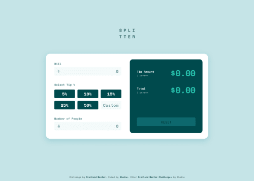
Responsive tip calculator app with plain JS and Sass

#accessibility#cube-css#sass/scss
Elaine 11,420

@elaineleung

Desktop design screenshot for the Tip calculator app coding challenge

This is a solution for...

  • HTML
  • CSS
  • JS
2junior
View challenge

Design comparison


SolutionDesign

Solution retrospective


At first I built this with the goal of just making it function as intended, but I later felt to challenge myself to make this a more inclusive app with better accessibility, which meant I opted to use radio inputs for the tip percentages instead of just buttons and also to make the tab button work with the inputs. This took me a really long time because the biggest challenge was in how to group a visually hidden radio input with a text input (i.e., the custom text input) and work out all the logic with :focus, :checked, etc., and also how to make everything work smoothly when tabbing. Because of this, writing out the CSS and HTML was actually a lot harder than the JS, since I needed to figure out how to use the hidden custom radio button to affect the styling of the text input. I think it's pretty close to completion after some major updates, just need to clean and refactor, and do a tad more with the tabindex😌

I found @sedcakmak's solution to be an excellent reference when I was trying to make improvements to my code, so shoutout to her 🙂

Would love to hear some input from the accessibility experts out there or any user really!

Community feedback

Macdeesh 610

@macdeesh

Posted

Hi Elaine, this looks really nice ! Very good work !! Bravo !!

In case the amount of the bill is a big number like more than 7 zeros, the result of the calculation in Tip amount/person and total/person is too long and take place over the calculator, to fix this add an overflow-x: scroll on the amount fields.

You forget to make the error message when the number of people is not added or 0. Or maybe it's by choice ?

Marked as helpful

1

Elaine 11,420

@elaineleung

Posted

@macdeesh Thank you for letting me know about large numbers; I might opt to make the font size smaller in that case instead of using overflow: scroll, but that is certainly an option!

Yes, the omission is by choice. I initially had that in my function, but when I looked at the design again and compared the empty and active states, there's no error message when the state is empty; it's only there when 0 is actually an input. It's also a better user experience without the error message in empty state; when I was testing it and whenever I deleted the previous input, the message would show up each time, and it felt like it was too "in your face" and annoying. It made me want to quickly input a number just so I won't see the message 😅. It's never good when users get annoyed!

1
Elaine 11,420

@elaineleung

Posted

@macdeesh Hi Macdeesh, I fixed the overflowing digits, so if you want to give it another test, feel free to do so 😊

1
Macdeesh 610

@macdeesh

Posted

@elaineleung Hello Elaine, I just tested again, and it's perfect !! I prefer your solution to the overflow-x: scroll, for a better user experience. Well done !

1
Elaine 11,420

@elaineleung

Posted

@macdeesh Thanks again for catching it 😊

0
Lucas 👾 104,560

@correlucas

Posted

👋 Hello Elaine, congratulations for your solution.

Your solution design is so perfect, I never saw no one with a solution that match 100% the reference image.

Can you give some tips to achieve the pixel perfect like you've done?

I've the premium subscription and the Figma files, but even having the information for each element, color, padding and etc. My solutions are a little bit different when I compare them inside the solution panel slider.

What's your secret? 🤓

I'm really impressed how accurate it is, you dont miss a single pixel ❤️

Anyway, congratulations for this challenge and also the others. Really good.

Lucas

1

Elaine 11,420

@elaineleung

Posted

@correlucas Hi Lucas, thank you for the compliment! I've gotten asked about this a few times, and it made me realize this is actually not that easy (I mean, it's wasn't easy for me either and took me a long time to find a way that works best 😅), but I think with lots of practice and the right technique, there's a way to be close to perfect even without the design reference sizes.

Here's roughly what I normally do:

  • I work on building the HTML structure and styling all the elements with color first, especially in making sure the containers with background color are styled so that I can use them for reference.

  • I check the sizes of the mobile and design designs, and use the responsive design mode in the inspector to make sure the screen is at the sizes of the design image, depending on which view I'm working in (I always start with mobile view first)

  • I then try to figure out what the size of the component is and the main containers. I first place half my screen placed on top of the image and make sure the top of the viewport matches the top of the image, which means I'm using the top as my reference point (this is the technique I use throughout my work to make sure things line up, and I often need to resize the browser a lot when checking). After that I give a top padding to my component container by roughly measuring the top padding in the design (this is just temporary because it's just easier to work this way when the browser doesn't have to calculate the space in centering the component, and after everything is done I would remove the padding and center the component using grid). I do the same thing with the horizontal padding too, except I usually use min() with width nowadays instead of padding/margin.

  • I then work on font size and line height; line height is especially important because it can determine the spacing of everything. I always have the font size on the body element at 1rem, and I almost always use rem units, unless there are things like breakpoints and image sizes.

  • I then do the layout and add margins and padding accordingly. I normally use a top-down approach where I use margin-bottom to space out an item if needed, and if it's a flex/grid item, then gap is my first choice

I think that's about all I can think of; it just mainly takes a lot of practice to train the eye. I used to fuss a lot over decimal points, but I discover that things are usually in whole numbers or 0.1/0.25 increments in rem. I used to do things like 1.1343 rem for a font size, but nowadays I just always keep my font sizes at the typical ones because in reality, no designer has the time to set a custom font size anyway.

Good luck, and I hope some of this helps you!

5
Lucas 👾 104,560

@correlucas

Posted

@elaineleung Thank you a lots! I was thinking wasn't even possible to match 100% the reference, until I saw your solution on the comparison view, this is just amazing. Congrats again and thanks for the tips, I'll try that in my next challenge. 👏👏

1

@joeymalope-za

Posted

@elaineleung Hey! thanks for taking the time to share your thinking process behind implementing pixel-perfect designs. I found your approach very insightful, I can't wait to try out some of your tips. 😀

1
Elaine 11,420

@elaineleung

Posted

@joeymalope-za Thanks for the comment Joey, I'm glad Lucas asked too because it made me really think about my process. I ended up making a few changes to my notes above as I got to think a bit more, but yeah I hope it can help you all out!

0
martinxo 20

@martinxo

Posted

@elaineleung Gosh, this is super useful Elaine, many thanks!

0

Please log in to post a comment

Log in with GitHub
Discord logo

Join our Discord community

Join thousands of Frontend Mentor community members taking the challenges, sharing resources, helping each other, and chatting about all things front-end!

Join our Discord