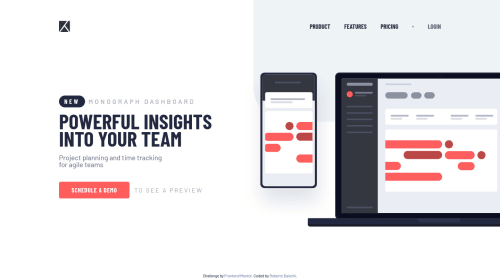
Submitted almost 3 years agoA solution to the Project tracking intro component challenge
Responsive Tracking-Intro

@RobertoBaiochi
Solution retrospective
I tried to make it as responsive as possible. One question, how would you make the mobile menu tab also close when clicked on any other part of the screen? Any feedback would be great.
Code
Please log in to post a comment
Log in with GitHubCommunity feedback
- P@jgreen721
You can probably just attach a click event to the body that can check to see if the menu is displayed and if so, remove it. Just add an exit condition incase the user has clicked on the actual menu (ie
if(e.target.classList.contains("open-icon-menu")return)Nice work on the page arrangement!
Marked as helpful

Join our Discord community
Join thousands of Frontend Mentor community members taking the challenges, sharing resources, helping each other, and chatting about all things front-end!
Join our Discord