


Raymart Pamplona• 16,140
@pikapikamart
Posted
Hey, great work on this one. I rarely see this challenge so I am on luck to seeing this one. Layout in desktop is good as well as for the mobile state. In terms of responsiveness, it is fine as well.
Some suggestions would be:
- The
atag that wraps theheaderlogo should have anaria-labellikearia-label="homepage". This way, a screen reader user would know where this link would navigate them hence it will bring them to the "homepage" of your website. - The
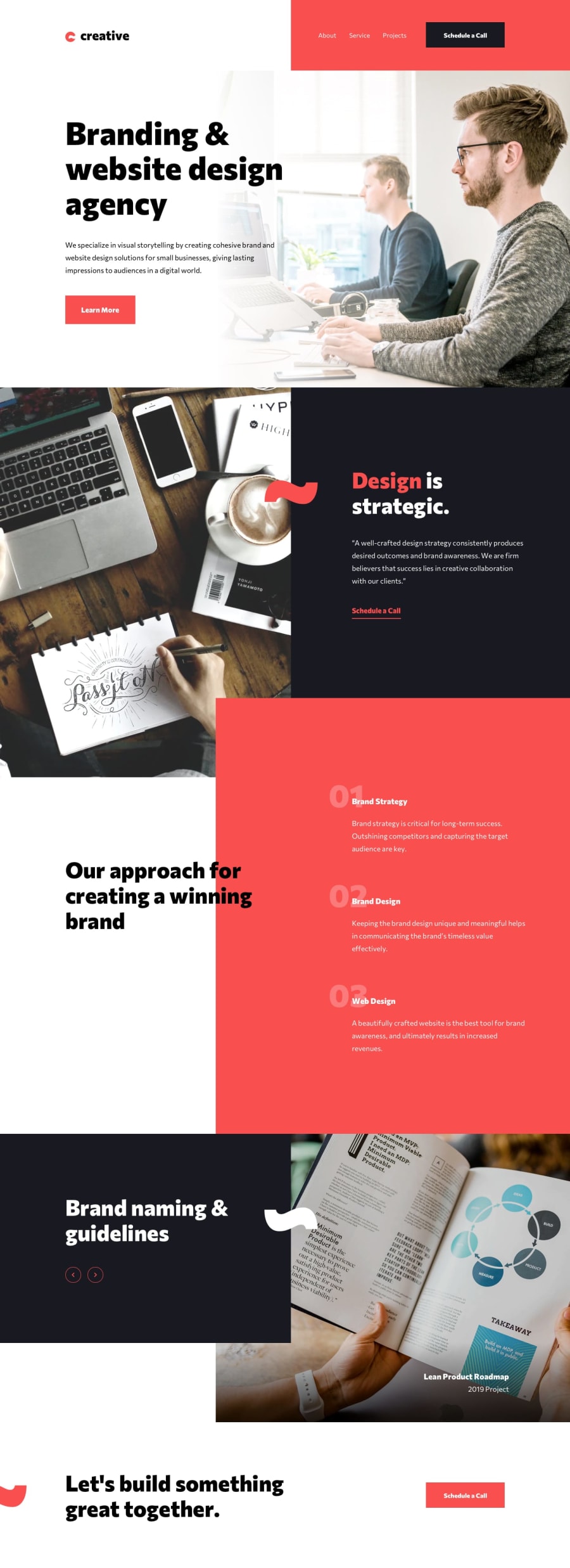
imgas well on theheadershould have thealtbe likealt="creative". The logo itself have the text "creative" and it would be great to have thealtto be that as well. Also when addingalttext to an image, do not add the word "logo, picture, icon, graphic" anything else that relates to "image" word. Assistive tech will handle those for you. alttext for the hero section image could be better and not just "background". If you think an image adds a content, make bit more descriptivealttext.alttext for other section images as well could be better and descriptive.- The slider arrow toggler should have used a
buttonelement and not justimg. Usingimgon this one is not really accessible and keyboard or screen reader users won't be able to toggle it.buttonwould be good along with it'saria-labellike "change slider". Since the slider doesn't really contains any text that can be read, there is no need for it to be focused on this, I say this if you were to have those focused on javascript like.focus(). - On mobile layout, the hamburger menu should have used a
buttonelement witharia-expandedattribute andimg. Also, since you are adding like a no-scroll, it would be good to trap the focus to the dropdown only along with the hamburger toggler.
But still, you did a good job on this one. Really liked this one.
Marked as helpful
0
