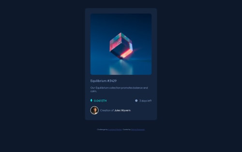
Submitted over 3 years agoA solution to the NFT preview card component challenge
Responsive using flex and width percentage
foundation

@patrickbasamot
Solution retrospective
How's my approach ? bad styling practice?
Code
Please log in to post a comment
Log in with GitHubCommunity feedback
- @denielden
Hi Patrick, great work on this challenge! 😉
Here are a few tips for improve your code:
- add
maintag and wrap the card for improve the Accessibility - add descriptive text in the
altattribute of the images - to make it look as close to the design as possible set
width: 22remtocardclass - remove all
marginfromcardclass - use flexbox to the body to center the card. Read here -> best flex guide
- after, add
min-height: 100vhto body because Flexbox aligns child items to the size of the parent container - add
transitionon the element with hover effect - instead of using
px or %use relative units of measurement likerem-> read here
Overall you did well 😁 Hope this help!
Marked as helpful - add
- @NAZIRwill29
@patrickbasamot
That was really great.
div card should be wrapped in
<main>. It is best practice to wrap content in<main>.For hover to show
icon-view.svg, you can make<div>wrapicon-view.svgandbackground colorcyan to the<div>. Make it hover manipulatez-indexrather thanopacity.Marked as helpful


Join our Discord community
Join thousands of Frontend Mentor community members taking the challenges, sharing resources, helping each other, and chatting about all things front-end!
Join our Discord