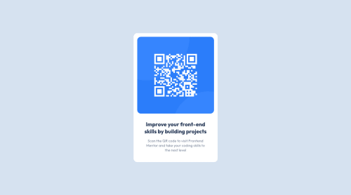
Responsive using flex , margin , padding , min-height , and more

Solution retrospective
Q : What did you find difficult while building the project? A : make card center and using margin , padding , min-height , flex
Q : Which areas of your code are you unsure of? A : min-height , flex
Q : Do you have any questions about best practices? A : margin , padding , min-height , flex
Please log in to post a comment
Log in with GitHubCommunity feedback
- @SatellitePeace
`Hello @Fakemilaz your card looks nice
-
min-height specifies the minimum height the body of your content should have
-
adding min-height to your body tag ensures that the length of your entire content shows and if your content length is more than 100vh the user will be able to scroll to see the entire content
-
For you to center your card with flex you have to add a height or min-height, you also need to add the justify-content property in addition to the align-items property
-
this is to ensure that your card is centered both horizontally and vertically
-
Also add a margin to the body so that the card will have some space from the body in a smaller screen
-
like the example below
body { background: hsl(212, 45%, 89%); min-height: 100vh; display: flex; align-items: center; justify-content: center; margin: 2rem, }- Also when you add a max-width you should also add a width of 100% so that in screen sizes below 375px your card will adjust and still look good
.container { max-width: 375px; width:100% margin: 0 auto; }
Overall you used flex, and margins properly - Do not use px for font-size use rem or em units instead I Hope This Helps -

Join our Discord community
Join thousands of Frontend Mentor community members taking the challenges, sharing resources, helping each other, and chatting about all things front-end!
Join our Discord