Responsive using flexbox. HTML - CSS

Solution retrospective
Thanks fin advance for any feedback.
Please log in to post a comment
Log in with GitHubCommunity feedback
- @PhoenixDev22
Greeting Luis,
Congratulation on completing this frontend mentor challenge.
I have some suggestions regarding your solution:
-
There should be two landmark components as children of the body element - a
main(which will be the NFT card) as you did and afooter(which will be the attribution).<Footer>should not be in the<main >. HTML5 landmark elements are used to improve navigation . -
Anything with a hover style in design means it's interactive. you need to add an interactive element
<a>around the image. -
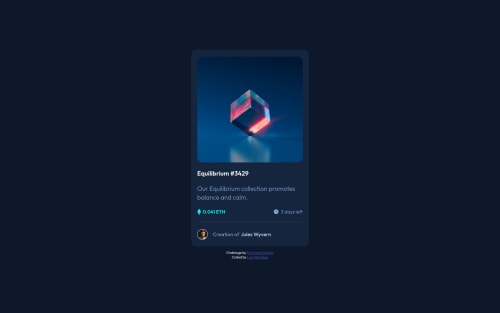
For any decorative images, each img tag should have empty
alt=""andaria-hidden="true"attributes to make all web assistive technologies such as screen reader ignore those images in(icon-view, icon-ethereum, icon-clock).
The link wrapping the equilibrium image should either have
Sr-onlytext, anaria-labeloralttext that says where that link takes you.-
No need to mention
imagein the alternative text as It’s going to be obvious to either a person or a machine when something they're accessing is alt text also When you write alternative text, it should not be hyphenated. -
The avatar's alt should not be image-avatar. It's meaningless .You can use the creator's name
Jules Wyvern. Read more how to write an alt text -
To use more semantic tags , you can use
<ul>to wrapclass="update"and in each<li>there would be<img>and<p>. (not a <h2>) You can use<figure>and<figcaption >for the avatar's part.
CSS
-
font-size: 62.5%;this has huge accessibility implications for those of us with different font size or zoom requirements. It's recommended not change the html or root font size. -
Consider using
min-height: 100vh;instead of height: 100% to the body allows the body to set a minimum height value based upon the full height of the viewport also allows the body to to grow taller if the content outgrows the visible page.
General points :
-
It's recommended to use
emandremunits .Bothemandremare flexible, Usingpxwon't allow the user to control the font size based on their needs. -
Remember a css reset on every project. That will do things like set the images to display block and make all browsers display elements the same.
Overall , your solution is good. Hopefully this feedback helps.
Marked as helpful -

Join our Discord community
Join thousands of Frontend Mentor community members taking the challenges, sharing resources, helping each other, and chatting about all things front-end!
Join our Discord