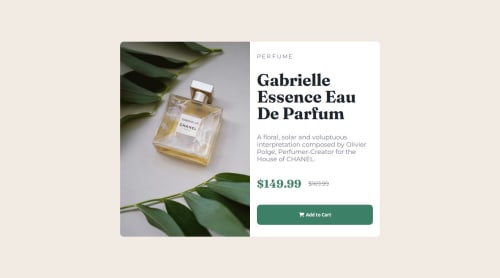
Submitted 20 days agoA solution to the Product preview card component challenge
Responsive using picture/media query

@niophan
Solution retrospective
What are you most proud of, and what would you do differently next time?
I 'm proud of figuring out how to use different images with picture element, and how to achieve border-radius when the view is divided into 2 parts( picture and text box) Besides, it is great to review somewhat sass, which i havenot touched for long.
What challenges did you encounter, and how did you overcome them?I found it somewhat not similar to the original design, due to the difference of icon selection.
Code
Please log in to post a comment
Log in with GitHubCommunity feedback
- @bccpadge
Hi Nhan Phan. Congratulations on completing this challenge!!!🎉
HTML 📃:
- Refactor
index.htmlto incorporate HTML semantic tags. - Wrap Gabrielle Essence Eau De Parfum in
<h1>. - Use
<del>for the original price to apply an automatic strikethrough. - For the price section add more context for screen readers by deferentially the prices
<div> <p class="product-price"> <span class="visually-hidden">Current Price:</span> $149.99 </p> <p class="product-original-price"> <span class="visually-hidden">Orginial Price:</span> <del>$169.99</del> </p> </div>- The
visually-hiddenCSS class hides the text visually on the website but accessed by screen readers
/* sometimes referred to as .sr-only */ .visually-hidden:not(:focus):not(:active):not(:focus-within) { clip-path: inset(50%); height: 1px; overflow: hidden; position: absolute; white-space: nowrap; width: 1px; }- Implement hover state for the button and
cursor: pointerfor better interactivity and make sure it focusable and usable by keyboard.
Here is my solution to this challenge: Product Preview card component
I hope you find this useful and don't hesitate to reach out if you have any questions.
- Refactor

Join our Discord community
Join thousands of Frontend Mentor community members taking the challenges, sharing resources, helping each other, and chatting about all things front-end!
Join our Discord