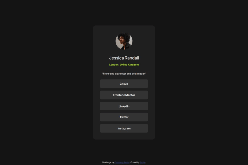
Responsive web page with CSS Flexbox

Solution retrospective
Achieving a clean and centered layout using CSS Flexbox, even on different screen sizes. Adding hover effects with smooth transitions to improve interactivity and visual feedback. I'LL Focus even more on mobile-first design by starting with the smallest viewport and scaling up cleanly.
What challenges did you encounter, and how did you overcome them?One of the biggest challenge I faced was making the design look good on mobile vs desktop. The design file was a static JPG, so I had to use my best judgment to estimate things like font-size, padding, and spacing. I learned to rely on rem units and test different screen widths using media queries to achieve a responsive layout.
What specific areas of your project would you like help with?Better performance and coding practices—for example, using a mobile-first approach, improving CSS organization, and avoiding unnecessary styles.
Please log in to post a comment
Log in with GitHubCommunity feedback
No feedback yet. Be the first to give feedback on JiaHe35354's solution.
Join our Discord community
Join thousands of Frontend Mentor community members taking the challenges, sharing resources, helping each other, and chatting about all things front-end!
Join our Discord