Not Found
Not Found
Not Found
Not Found
Not Found
Not Found
Not Found
Not Found
Not Found
Request path contains unescaped characters
Not Found
Not Found
Not Found
Not Found
Not Found
Not Found
Not Found
Not Found
Not Found
Not Found

Submitted

Responsive webpage using CSS Grid and Flexbox

Trevor Merrickβ€’ 150

@tmerrick17

Desktop design screenshot for the Social proof section coding challenge

This is a solution for...

  • HTML
  • CSS
1newbie
View challenge

Design comparison


SolutionDesign

Solution retrospective


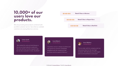
Had a lot of fun with this one. I used CSS Grid for the magenta cards but everything else was constructed using Flexbox.

I also added a tablet view that's slightly modified from what the mobile view is.

Community feedback

Topi Eskelinenβ€’ 25

@topieskelinen

Posted

@tmerrick17 got any good resources for css grid? I tried to power through with flexbox only but ran into issues with the purple boxes and them keeping their heights constant when adding extra margin at the top...

0

Trevor Merrickβ€’ 150

@tmerrick17

Posted

@topieskelinen CSS Grid is super fun once you get a hang of it. Also I use CSS Grid but only when needed, like in a card in this challenge.

Here are 3 great places to start:

Courses: Wes Bos: Free CSS Grid course Wes Bos has a free course that I ran through. Just a good course to get more of an understanding of CSS Grid. He and Scott Tolinski also have a great podcast as well.

Youtube: Kevin Powell I go back to his Youtube channel all the time. He has videos on all things CSS. This video is simply one to start on with CSS Grid

Jen Simmons This lady is smart and is great at showing examples. This video is just a starting place in her Youtube channel. She actually works at Mozilla so she is a great valid resource.

I didn't mean to give you too much in resources but I kinda got carried away. I love sharing other great developer's out there that have a knack for teaching. Good luck!

1
Topi Eskelinenβ€’ 25

@topieskelinen

Posted

@tmerrick17 thank you good sir! I'll definitely check out all of the above ☺️ All the best.

0
P
Fluffy Kasβ€’ 7,735

@FluffyKas

Posted

Hey, your solution looks great! I only have a few suggestions for you:

  1. I'd change the text color of the reviews, at the moment there's not enough contract with the background.

  2. Perhaps it would be a good idea to remove the alt text "gold star", as the screen reader would probably read all 5 of them in each row and that may sound a bit annoying ^^

0

Trevor Merrickβ€’ 150

@tmerrick17

Posted

@FluffyKas Thanks! I removed the gold star alt text. I need to use a screen reader to help simulate for more accessibility issues. Good point.

I upped the font-weight back to 400 for the review text. It actually looks a little to thick at 400 compared to the demo picture but it should help the white color come through better. Thanks again for the feedback!

UPDATE: I also see that my font-size is just a little smaller so that should help too if I up that a little.

0
Topi Eskelinenβ€’ 25

@topieskelinen

Posted

@FluffyKas good tip, had that thought for a moment myself but left the alt texts in anyway πŸ˜… should probs remove them in any real world usecase.

0

Please log in to post a comment

Log in with GitHub
Discord logo

Join our Discord community

Join thousands of Frontend Mentor community members taking the challenges, sharing resources, helping each other, and chatting about all things front-end!

Join our Discord