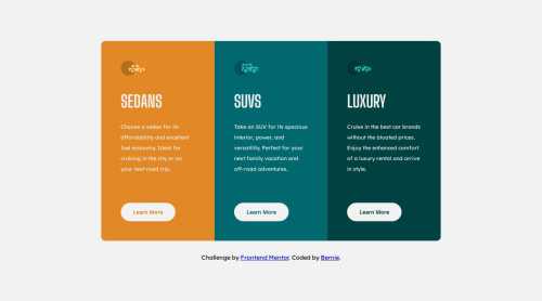
Submitted about 1 year agoA solution to the 3-column preview card component challenge
Responsive website component with CSS Grid and Media Queries
accessibility

@SoftPillow20
Solution retrospective
What are you most proud of, and what would you do differently next time?
I've been practicing and learning how to use CSS Grid properly. In this type of design component I know it would be easier If I use flexbox but using the CSS Grid is more practical, IMO.
What challenges did you encounter, and how did you overcome them?There are challenges that I did encounter while doing this challenge, such as using the queries in different kinds of resolution sizes and making sure that it looks good in all of it.
Code
Please log in to post a comment
Log in with GitHubCommunity feedback
No feedback yet. Be the first to give feedback on Bernie's solution.
Join our Discord community
Join thousands of Frontend Mentor community members taking the challenges, sharing resources, helping each other, and chatting about all things front-end!
Join our Discord