Not Found
Not Found
Not Found
Not Found
Not Found
Not Found
Not Found
Not Found
Not Found
Not Found
Not Found
Not Found
Not Found
Not Found
Not Found
Not Found
Not Found
Not Found
Not Found
Not Found

Submitted

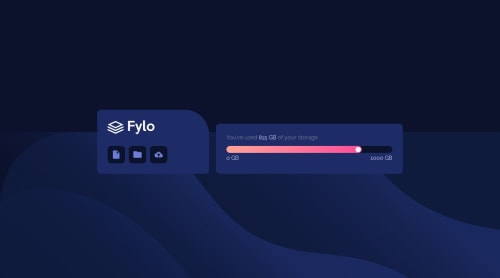
Responsive Webpage using CSS Flexboxes

jeantiston 170

@jeantiston

Desktop design screenshot for the Fylo data storage component coding challenge

This is a solution for...

  • HTML
  • CSS
2junior
View challenge

Design comparison


SolutionDesign

Solution retrospective


I'm fairly new to turning mockups to html/css. Also, quite new to flexboxes. So a lot of things felt like hit and miss.

Is there a simpler way I could have done this? Do I really need to use so much divs to make everything in their proper places?

What's the best practice on how the CSS is arranged? Is there a best practice besides putting the important ones below? (Since it's cascading)

I was trying to make it responsive without using a media query (since flexboxes are, well, flexible) but I can't seem to do it because the navigation box is not the same width as the main box (On the desktop site). Is there a way to do so?

Any constructive feedback would be really appreciated!

Community feedback

P

@emestabillo

Posted

Hi Jean, great effort here!

  1. Do I really need to use so much divs to make everything in their proper places?

In this project, you can do away with some of the divs. I usually consider deleting a wrapper if I don't put any style on it / need it for JS / serving any other purpose.

  1. What's the best practice on how the CSS is arranged? Is there a best practice besides putting the important ones below? (Since it's cascading)

Actually, the styles at the TOP of the stylesheet are of special importance - they get loaded FIRST. That’s why it’s highly recommended to code mobile-first since majority of people will use their phones to view your site. Does coding desktop-first still work? Sure, but I find it harder to undo element positioning from large to small devices. And for a large project, you might see a millisecond flash of the desktop styles before it settles because placing the mobile styles at the end means it will not be read until the entire CSS file is almost entirely parsed. This might be going too deep :-) When you get more comfortable writing CSS, look into preprocessors such as SASS for a more structured file arrangement.

As for the cascade, yes, order is important. But there are other nuances to learn like specificity and inheritance. Check out this article. Here’s another one.

  1. I was trying to make it responsive without using a media query (since flexboxes are, well, flexible) but I can't seem to do it because the navigation box is not the same width as the main box (On the desktop site). Is there a way to do so?

I don’t have enough experience to answer yes, but the safe answer is that it probably depends on the project. We work on these websites for others to use, and thus, you don’t want to sacrifice UI/UX just so you could write less code. Plus, this project has that speech bubble. I don't know how to change its position without a media query. BTW, why is it currently set to display: none?

Hope this helps! :-)

2

jeantiston 170

@jeantiston

Posted

@emestabillo

Hi Emmilie! First of all, thank you for the detailed feedback, I really appreciate it!

  1. I had too many wrappers because I was doing flexbox within a flexbox to position the elements. I just realize might not have named the wrapper classes appropriately cause I was adding them as I go. Then it became quite confusing with every additional wrapper I added. I should probably revisit it and look at which divs did not serve any purpose.

  2. That is really interesting. I've never really considered mobile-first until now. You make a very good case for it. 👍 I'll keep that in mind for my next projects. And thank you for the links to the articles!

  3. That's true, we really need to keep the user in mind. 👍 The speech bubble appears when you hover on the storage progress bar that's why it's display: none. I know It was not explicitly said in the brief but from my experience dashboards usually only display that additional info on hover.

Thanks again for your feedback! This would really help me improve it!

2

@Thechampion96

Posted

Lol, Your questions are right on points, I wish someone will share how they solve problems you mentioned above.

The bottom background photo should cover the full width, to fix it add this inside your body tag background-size: 100% 50%;

Well done!!

1

jeantiston 170

@jeantiston

Posted

@Thechampion96 thanks for spotting that! Will add it 👍

I really hope someone will answer those questions. 🙌

0

Please log in to post a comment

Log in with GitHub
Discord logo

Join our Discord community

Join thousands of Frontend Mentor community members taking the challenges, sharing resources, helping each other, and chatting about all things front-end!

Join our Discord